Compare commits
| Author | SHA1 | Date | |
|---|---|---|---|
 WitcherCheung |
0859e49946 | ||
 witcher |
0bd5123176 | ||
|
witcher
|
9c1d9f8f85 | ||
|
Erzbir
|
f35d919733 | ||
|
Erzbir
|
54eb1419eb | ||
|
Erzbir
|
249a1deae6 | ||
|
Erzbir
|
b9e0364b49 | ||
|
Erzbir
|
7ee2cf1e2d | ||
|
Erzbir
|
e0b2e9ff70 | ||
|
Erzbir
|
27f21f7d2c |
@@ -2,138 +2,53 @@
|
|||||||
|
|
||||||
一款简洁, 复古的 Terminal 风格 Halo 主题
|
一款简洁, 复古的 Terminal 风格 Halo 主题
|
||||||
|
|
||||||

|
<a href="https://raw.githubusercontent.com/Erzbir/halo-theme-terminal/refs/heads/main/screenshot.png">预览图</a>
|
||||||
|
<a href="https://witchercheung.cn">预览网站</a>
|
||||||
|
|
||||||
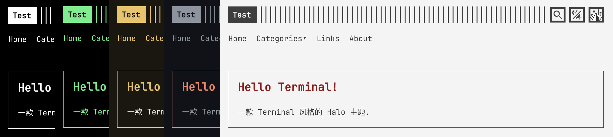
|
## 使用说明
|
||||||
|
|
||||||
## 功能
|
|
||||||
|
|
||||||
- Terminal 风格的响应式页面布局
|
|
||||||
- 浅色, 深色和跟随系统 3 种外观模式, 页头按钮会显示太阳, 月亮或圆圈图标
|
|
||||||
- 12 套内置配色和多套自定义配色
|
|
||||||
- 可分别控制页头的搜索, 配色选择, 外观切换和像素化按钮
|
|
||||||
- 常规图标和像素图标切换
|
|
||||||
- 内置 JetBrains Mono, Hack 和 Fira Code 字体, 也可使用访客系统字体
|
|
||||||
- 支持多字体 fallback, PostScript Name 本地匹配和高级 `@font-face` 配置
|
|
||||||
- 基础行高, 文章段落间距和文章元信息分隔符配置
|
|
||||||
- 首页公告打字效果
|
|
||||||
- 文章目录和目录展开状态配置
|
|
||||||
- 文章标签, 置顶标记和上一篇/下一篇导航
|
|
||||||
- Halo 评论组件适配
|
|
||||||
- Halo 搜索组件适配
|
|
||||||
- PJAX 页面切换
|
|
||||||
- 多级菜单
|
|
||||||
- 社交资料和 RSS
|
|
||||||
- ICP 备案和公安备案信息
|
|
||||||
- 首页, 文章, 独立页面, 归档, 分类, 标签, 友链和错误页模板
|
|
||||||
- 瞬间, 朋友圈和项目作品集页面模板
|
|
||||||
- 英文, 简体中文, 繁体中文和西班牙文界面文本
|
|
||||||
|
|
||||||
## 页面和集成
|
|
||||||
|
|
||||||
| 页面或功能 | 模板或条件 |
|
|
||||||
|-----------|------------------------------------------------------------------------|
|
|
||||||
| 首页 | `templates/index.html` |
|
|
||||||
| 文章页 | `templates/post.html` |
|
|
||||||
| 独立页面 | `templates/page.html` |
|
|
||||||
| 归档页 | `templates/archives.html` |
|
|
||||||
| 分类列表和分类详情 | `templates/categories.html`, `templates/category.html` |
|
|
||||||
| 标签列表和标签详情 | `templates/tags.html`, `templates/tag.html` |
|
|
||||||
| 友链页 | `templates/links.html` |
|
|
||||||
| 朋友圈 | `templates/friends.html`, 需要朋友圈插件 |
|
|
||||||
| 瞬间 | `templates/moments.html`, 需要瞬间插件 |
|
|
||||||
| 项目作品集 | `templates/portfolio.html`, `templates/portfolio-detail.html`, 需要作品集插件 |
|
|
||||||
| 搜索 | 搜索组件可用且开启页头搜索按钮时显示 |
|
|
||||||
| 评论 | 启用评论插件并开启评论功能时显示评论组件 |
|
|
||||||
| 错误页 | 提供 `404`, `5xx` 和通用错误模板 |
|
|
||||||
|
|
||||||
## 主题设置
|
|
||||||
|
|
||||||
### 通用设置
|
### 通用设置
|
||||||
|
|
||||||
| 设置 | 配置名 | 说明 |
|
- `时间格式` 提供常用格式, 也可以填写自定义 Java 时间格式
|
||||||
|-------|---------------------------------------------------|-------------------------|
|
- `访客偏好有效期` 控制外观, 配色和像素风格的保存时间, 默认为 24 小时, 设为 `0` 时永久保存
|
||||||
| 时间格式 | `general.time_style`, `general.custom_time_style` | 支持预设格式或自定义 Java 时间格式字符串 |
|
- `PJAX` 默认关闭; 开启后支持局部刷新, 如果遇到插件兼容问题可以将其关闭
|
||||||
| 偏好有效期 | `general.prefer_ttl` | 访客偏好的保存小时数, `0` 表示永久保存 |
|
|
||||||
| PJAX | `general.pjax_enable` | 默认关闭, 开启后站内链接只更新主要内容 |
|
|
||||||
|
|
||||||
访客手动选择的外观模式, 配色和像素风格会保存在浏览器的 `localStorage` 中. 默认有效期为 24 小时,
|
### 页头功能按钮
|
||||||
偏好过期后会在下次访问时恢复主题默认值. 已有但没有过期时间的偏好会在升级后的首次访问时开始计算有效期.
|
|
||||||
|
|
||||||
### 页头
|
页头默认包含搜索, 配色切换, 外观切换和像素化按钮. 可以在 `页头 -> 功能按钮` 中添加, 删除或拖动按钮来控制显示顺序.
|
||||||
|
|
||||||
| 设置 | 配置名 | 说明 |
|
- 搜索按钮仅在搜索组件可用时显示
|
||||||
|---------|---------------------------------------|------------------|
|
- 内置按钮可以分别设置普通图标和像素风格图标, 留空时使用主题内置图标
|
||||||
| Logo 文本 | `header.logo` | 留空时使用 Halo 站点标题 |
|
- 自定义功能按钮需要填写名称, `onclick` JavaScript 和图标; 只应填写可信任的 JavaScript
|
||||||
| 搜索按钮 | `header.search_button_enable` | 搜索组件插件可用时展示 |
|
|
||||||
| 配色切换按钮 | `header.color_scheme_switcher_enable` | 展示自动发现的配色列表 |
|
|
||||||
| 深浅切换按钮 | `header.appearance_switcher_enable` | 在浅色, 深色和跟随系统之间循环 |
|
|
||||||
| 像素化按钮 | `header.pixel_style_switcher_enable` | 切换像素字体和像素图标 |
|
|
||||||
|
|
||||||
外观切换顺序为 `浅色 -> 深色 -> 跟随系统`; 图标依次为太阳, 月亮和圆圈. 切换外观模式时会清除访客单独选择的配色,
|
外观切换顺序为 `浅色 -> 深色 -> 跟随系统`. 切换外观时会清除访客单独选择的配色, 重新使用当前外观对应的主题方案.
|
||||||
让浅色和深色模式重新使用主题设置中对应的方案.
|
|
||||||
|
|
||||||
### 字体与排版
|
|
||||||
|
|
||||||
| 设置 | 配置名 | 说明 |
|
|
||||||
|-------|-------------------------------------|----------------------------------------|
|
|
||||||
| 默认字体 | `typography.default_font` | 系统字体, JetBrains Mono, Hack 或 Fira Code |
|
|
||||||
| 自定义字体 | `typography.custom_font_enable` | 启用自定义字体列表 |
|
|
||||||
| 字体列表 | `typography.custom_fonts` | 按顺序组成字体 fallback |
|
|
||||||
| 字体大小 | `typography.font_size` | 接受 `16px`, `1rem` 等 CSS 长度 |
|
|
||||||
| 行高 | `typography.line_height` | 接受 CSS 长度或 `calc(...)` |
|
|
||||||
| 段落间距 | `typography.post_paragraph_spacing` | 控制文章正文段落的上下间距 |
|
|
||||||
|
|
||||||
每项自定义字体可以填写字体名称, PostScript Name, 字体文件和格式. 浏览器会先用 PostScript Name
|
|
||||||
匹配本地字体, 未命中时再加载文件. 高级设置支持字重, 样式, Unicode 范围, 显示策略, OpenType 特性,
|
|
||||||
可变字体轴和字体度量覆盖等 `@font-face` 描述符.
|
|
||||||
|
|
||||||
字体优先级如下:
|
|
||||||
|
|
||||||
1. 开启像素风格时使用内置 `Fusion Pixel 12px Prop zh_hans`
|
|
||||||
2. 未开启像素风格且启用自定义字体时, 按自定义字体列表顺序组成 fallback
|
|
||||||
3. 其他情况使用“默认字体”中选择的内置字体或 `system-ui`
|
|
||||||
|
|
||||||
### 布局
|
|
||||||
|
|
||||||
| 设置 | 配置名 | 说明 |
|
|
||||||
|--------|----------------------------|-----------------------------|
|
|
||||||
| 全屏布局 | `layout.fullscreen_layout` | 正文使用全部可用宽度 |
|
|
||||||
| 正文最大宽度 | `layout.max_width` | 接受 `960px`, `80vw` 等 CSS 长度 |
|
|
||||||
| 正文内边距 | `layout.content_padding` | 同时控制桌面端和移动端正文内边距 |
|
|
||||||
| 媒体最大宽度 | `layout.media_max_width` | 全屏布局中控制图片, 视频和 `figure` 宽度 |
|
|
||||||
| 表格铺满正文 | `layout.table_full_width` | 让正文中的表格宽度为 `100%` |
|
|
||||||
|
|
||||||
### 配色
|
### 配色
|
||||||
|
|
||||||
| 设置 | 配置名 | 说明 |
|
在 `配色` 中分别选择浅色和深色方案. 默认外观设为“跟随系统”时, 主题会根据访客的系统设置自动切换.
|
||||||
|-------|-------------------------------------|-----------------|
|
|
||||||
| 默认外观 | `color_scheme.default_appearance` | 可选浅色, 深色或跟随系统 |
|
|
||||||
| 浅色方案 | `color_scheme.light_color_scheme` | 浅色模式使用的内置或自定义配色 |
|
|
||||||
| 深色方案 | `color_scheme.dark_color_scheme` | 深色模式使用的内置或自定义配色 |
|
|
||||||
| 自定义方案 | `color_scheme.custom_color_schemes` | 添加多套自定义配色 |
|
|
||||||
|
|
||||||
浅色或深色方案选择 `custom` 时, 分别通过 `color_scheme.custom_light_scheme` 或
|
添加自定义配色:
|
||||||
`color_scheme.custom_dark_scheme` 填写自定义方案 ID. 自定义方案至少需要 ID, 背景色, 主文本色和基础强调色;
|
|
||||||
高级颜色设置可以覆盖辅助文字, 强调文字, 标签文字, 链接文字, 导航, 控件, 边框, 选中背景, 光标和代码颜色.
|
|
||||||
|
|
||||||
访客配色列表会从页面样式表中自动发现 `html[data-theme-color-scheme='name']` 选择器. 列表中的 `default`
|
1. 在 `配色 -> 自定义方案` 中添加一项并填写唯一 ID, 背景色, 主文本色和基础强调色.
|
||||||
用于清除访客选择并恢复当前外观模式对应的主题方案, 因此不要将 `default` 用作自定义配色 ID.
|
2. 如需更精细的效果, 开启高级颜色设置后配置文字, 链接, 导航, 控件, 边框和代码颜色.
|
||||||
|
3. 在浅色方案或深色方案中选择 `custom`, 再填写自定义方案的 ID.
|
||||||
|
4. 如需允许访客自由选择配色, 在 `页头 -> 功能按钮` 中保留或添加配色切换按钮.
|
||||||
|
|
||||||
### 全局样式
|
### 字体与像素风格
|
||||||
|
|
||||||
| 设置 | 配置名 | 说明 |
|
主题内置 JetBrains Mono, Hack 和 Fira Code, 也可以选择访客的系统字体. 如需加载自己的字体, 开启 `字体与排版 -> 启用自定义字体`, 再按优先级添加字体文件.
|
||||||
|--------|----------------------------------------------------------------------|---------------------------------------------------|
|
|
||||||
| 默认像素风格 | `global_style.pixel_style` | 使用像素字体和像素图标 |
|
|
||||||
| 列表标记 | `global_style.list_style` | 接受 CSS `list-style` 值 |
|
|
||||||
| 通用边线 | `global_style.border_width`, `global_style.border_style` | 控制通用边线宽度和样式 |
|
|
||||||
| 表格边线 | `global_style.table_border_width`, `global_style.table_border_style` | 控制表格边线宽度和样式 |
|
|
||||||
| 标题分隔线 | `global_style.title_divider_style` | 可选 `solid`, `dashed`, `dotted`, `double` 或 `none` |
|
|
||||||
| 元信息分隔符 | `global_style.post_meta_divider` | 控制时间, 作者和标签等元信息之间的分隔符 |
|
|
||||||
|
|
||||||
### 高级设置
|
每项自定义字体可以填写字体名称, PostScript Name, 字体文件和格式. 浏览器会优先匹配访客设备中的本地字体, 未找到时再加载字体文件. 高级设置可配置字重, 样式, Unicode 范围, 显示策略和可变字体轴等属性.
|
||||||
|
|
||||||
`advanced.custom` 用于填写自定义 CSS. 内容会写入页面 `<head>` 中并在主题主样式之后生效.
|
开启像素风格后, 主题会优先使用内置像素字体和像素图标.
|
||||||
|
|
||||||
|
### 布局与全局样式
|
||||||
|
|
||||||
|
- `全屏布局` 会让正文占满可用宽度, 并可单独限制正文图片, 视频和 `figure` 的最大宽度
|
||||||
|
- `正文区域最大宽度`, `正文区域内边距` 和 `表格宽度铺满父元素` 用于调整内容区域
|
||||||
|
- `基础字体大小`, `基础行高` 和 `文章段落间距` 用于调整阅读密度
|
||||||
|
- `无序列表标记`, 边线样式, 边线宽度和标题分隔线用于统一全站视觉风格
|
||||||
|
- `元信息分隔符` 用于分隔文章时间, 作者和标签等信息
|
||||||
|
|
||||||
### 页面设置
|
### 页面设置
|
||||||
|
|
||||||
@@ -146,18 +61,31 @@
|
|||||||
| 标签页 | 标签列表标题和标签详情标题 |
|
| 标签页 | 标签列表标题和标签详情标题 |
|
||||||
| 友链页 | 页面标题 |
|
| 友链页 | 页面标题 |
|
||||||
|
|
||||||
文章目录会读取正文中的 `h1` 到 `h4`, `auto` 模式在普通布局中默认展开, 在全屏布局中默认收起, 目录也会根据浏览器宽度和正文右侧空间调整位置.
|
文章目录会读取正文中的 `h1` 到 `h4`. “自动”模式在普通布局中默认展开, 在全屏布局中默认收起; 目录也会根据浏览器宽度和正文右侧空间调整位置.
|
||||||
|
|
||||||
### 社交资料
|
### 插件与扩展页面
|
||||||
|
|
||||||
首页可以添加任意社交资料. 每项资料可配置普通图标, 像素风格图标, 名称和链接; 链接支持
|
| 功能 | 使用条件 |
|
||||||
`http://`, `https://`, `mailto:` 和 `tel:`. RSS 可单独开启.
|
|-------|----------------------------------|
|
||||||
|
| 友链 | 安装并启用友链插件 |
|
||||||
|
| 友链申请 | 使用友链插件 `>=2.3.0`, 并在插件设置中开启友链申请 |
|
||||||
|
| 朋友圈 | 安装并启用朋友圈插件 |
|
||||||
|
| 瞬间 | 安装并启用瞬间插件 |
|
||||||
|
| 项目作品集 | 安装并启用作品集插件 |
|
||||||
|
| 搜索 | 安装并启用搜索组件, 并在页头功能按钮中添加搜索按钮 |
|
||||||
|
| 评论 | 安装并启用评论插件, 同时在 Halo 中开启对应内容的评论功能 |
|
||||||
|
|
||||||
### 备案信息
|
安装插件后, 对应页面会自动使用主题提供的样式和页面模板.
|
||||||
|
|
||||||
页脚支持 ICP 备案号, ICP 跳转链接, 公安备案号和公安备案跳转链接
|
### 社交资料与备案
|
||||||
|
|
||||||
## 内置配色
|
在 `社交资料` 中可以添加任意社交资料, 每项资料可配置名称, 链接, 普通图标和像素风格图标; 链接支持 `http://`, `https://`, `mailto:` 和 `tel:`.
|
||||||
|
|
||||||
|
添加后还需要开启 `首页 -> 展示社交资料` 才会在首页显示. RSS 可单独开启.
|
||||||
|
|
||||||
|
页脚支持 ICP 备案号, ICP 跳转链接, 公安备案号和公安备案跳转链接.
|
||||||
|
|
||||||
|
### 内置配色
|
||||||
|
|
||||||
| 名称 | 背景色 | 主文本色 | 基础强调色 |
|
| 名称 | 背景色 | 主文本色 | 基础强调色 |
|
||||||
|-------------|-----------|-----------|-----------|
|
|-------------|-----------|-----------|-----------|
|
||||||
@@ -174,45 +102,11 @@
|
|||||||
| `studio` | `#f7f4ff` | `#403352` | `#6f49ab` |
|
| `studio` | `#f7f4ff` | `#403352` | `#6f49ab` |
|
||||||
| `blood` | `#221f29` | `#ffffff` | `#ff6266` |
|
| `blood` | `#221f29` | `#ffffff` | `#ff6266` |
|
||||||
|
|
||||||
`day` 和 `night` 对弱化文字, 标签, 强调边框, 动态光标, 导航和控件使用了额外的语义颜色;
|
### 自定义 CSS
|
||||||
其他配色默认从主文本色和基础强调色派生这些角色.
|
|
||||||
|
|
||||||
`ink` 使用 `#5ac8fa` 链接色, `#c1c1c1` 弱化色和 `#1f1f1f` 行内代码背景;
|
|
||||||
`paper` 使用 `#406ed2` 链接色, `#595959` 弱化色和 `#ebebeb` 行内代码背景
|
|
||||||
|
|
||||||
## 自定义 CSS
|
|
||||||
|
|
||||||
在主题设置的 `高级设置 -> 自定义 CSS` 中填写原始 CSS. 自定义内容在主题主样式之后加载, 可以覆盖内置规则.
|
在主题设置的 `高级设置 -> 自定义 CSS` 中填写原始 CSS. 自定义内容在主题主样式之后加载, 可以覆盖内置规则.
|
||||||
|
|
||||||
### 新增自定义配色
|
直接使用内置配色名称即可覆盖对应变量:
|
||||||
|
|
||||||
下面的示例增加名为 `forest` 的配色:
|
|
||||||
|
|
||||||
```css
|
|
||||||
html[data-theme-color-scheme='forest'] {
|
|
||||||
--color-theme-background: #0f1a14;
|
|
||||||
--color-theme-text: #c7d8cc;
|
|
||||||
--color-theme-accent: #68d391;
|
|
||||||
|
|
||||||
/* Optional semantic colors */
|
|
||||||
--color-theme-text-muted: #81a88d;
|
|
||||||
--color-theme-text-accent: #8fe3a8;
|
|
||||||
--color-theme-text-label: #9ae6b4;
|
|
||||||
--color-theme-border-emphasis: #48bb78;
|
|
||||||
--color-theme-navigation: #c7d8cc;
|
|
||||||
--color-theme-control: #68d391;
|
|
||||||
--color-theme-caret: #48bb78;
|
|
||||||
}
|
|
||||||
```
|
|
||||||
|
|
||||||
保存后可以使用以下任一方式启用:
|
|
||||||
|
|
||||||
1. 在 `深色方案` 或 `浅色方案` 中选择 `custom`, 再填写 ID `forest`
|
|
||||||
2. 开启 `展示配色切换按钮`, 然后由访客在页头选择 `forest`
|
|
||||||
|
|
||||||
### 覆盖内置配色
|
|
||||||
|
|
||||||
直接使用内置配色名称即可覆盖对应变量:
|
|
||||||
|
|
||||||
```css
|
```css
|
||||||
html[data-theme-color-scheme='matrix'] {
|
html[data-theme-color-scheme='matrix'] {
|
||||||
@@ -222,7 +116,17 @@ html[data-theme-color-scheme='matrix'] {
|
|||||||
}
|
}
|
||||||
```
|
```
|
||||||
|
|
||||||
### 常用颜色变量
|
修改特定配色下的字体:
|
||||||
|
|
||||||
|
```css
|
||||||
|
html[data-theme-color-scheme='matrix'] {
|
||||||
|
--family-theme-font: system-ui;
|
||||||
|
}
|
||||||
|
```
|
||||||
|
|
||||||
|
### CSS 变量
|
||||||
|
|
||||||
|
#### 常用颜色变量
|
||||||
|
|
||||||
| 变量 | 用途 |
|
| 变量 | 用途 |
|
||||||
|---------------------------------|---------------------|
|
|---------------------------------|---------------------|
|
||||||
@@ -255,7 +159,7 @@ html[data-theme-color-scheme='matrix'] {
|
|||||||
派生颜色使用 CSS `color-mix()`. 自定义配色通常只需要设置背景色, 主文本色和基础强调色;
|
派生颜色使用 CSS `color-mix()`. 自定义配色通常只需要设置背景色, 主文本色和基础强调色;
|
||||||
相同语义在所有配色中保持一致, 只有确实需要不同视觉层级时才覆盖其他语义变量.
|
相同语义在所有配色中保持一致, 只有确实需要不同视觉层级时才覆盖其他语义变量.
|
||||||
|
|
||||||
### 常用布局变量
|
#### 常用布局变量
|
||||||
|
|
||||||
| 变量 | 默认值 |
|
| 变量 | 默认值 |
|
||||||
|--------------------------------------------|-----------------------------------------|
|
|--------------------------------------------|-----------------------------------------|
|
||||||
@@ -280,23 +184,7 @@ html[data-theme-color-scheme='matrix'] {
|
|||||||
| `--lig-theme-font` | `none` |
|
| `--lig-theme-font` | `none` |
|
||||||
| `--width-theme-scrollbar` | `thin` |
|
| `--width-theme-scrollbar` | `thin` |
|
||||||
|
|
||||||
修改特定配色下的字体:
|
### PJAX
|
||||||
|
|
||||||
```css
|
|
||||||
html[data-theme-color-scheme='matrix'] {
|
|
||||||
--family-theme-font: system-ui;
|
|
||||||
}
|
|
||||||
```
|
|
||||||
|
|
||||||
修改全局行高:
|
|
||||||
|
|
||||||
```css
|
|
||||||
:root {
|
|
||||||
--height-theme-line: calc(var(--size-theme-font) * 1.7);
|
|
||||||
}
|
|
||||||
```
|
|
||||||
|
|
||||||
## PJAX
|
|
||||||
|
|
||||||
PJAX 默认关闭, 开启后站内 `a[data-pjax]` 链接会更新以下区域:
|
PJAX 默认关闭, 开启后站内 `a[data-pjax]` 链接会更新以下区域:
|
||||||
|
|
||||||
@@ -321,12 +209,6 @@ PJAX 默认关闭, 开启后站内 `a[data-pjax]` 链接会更新以下区域:
|
|||||||
|
|
||||||
设置 `data-no-pjax` 属性, 可以防止被 PJAX 处理
|
设置 `data-no-pjax` 属性, 可以防止被 PJAX 处理
|
||||||
|
|
||||||
### 已知的问题
|
|
||||||
|
|
||||||
动态注入 JS 的时候可能会出现一些问题
|
|
||||||
|
|
||||||
- <del>highlightjs 插件的 _复制按扭_ 数量会随页面切换增加</del> (此插件目前已过时)
|
|
||||||
|
|
||||||
## 开发和构建
|
## 开发和构建
|
||||||
|
|
||||||
### 环境
|
### 环境
|
||||||
|
|||||||

|
Before Width: | Height: | Size: 244 KiB |

|
Before Width: | Height: | Size: 241 KiB |

|
Before Width: | Height: | Size: 257 KiB |

|
Before Width: | Height: | Size: 260 KiB |

|
Before Width: | Height: | Size: 254 KiB |

|
Before Width: | Height: | Size: 104 KiB |

|
After Width: | Height: | Size: 77 KiB |
@@ -1,7 +1,7 @@
|
|||||||
apiVersion: v1alpha1
|
apiVersion: v1alpha1
|
||||||
kind: Setting
|
kind: Setting
|
||||||
metadata:
|
metadata:
|
||||||
name: theme-terminal-ez-setting
|
name: theme-terminal-witcher-setting
|
||||||
spec:
|
spec:
|
||||||
forms:
|
forms:
|
||||||
- group: general
|
- group: general
|
||||||
@@ -49,26 +49,117 @@ spec:
|
|||||||
name: logo
|
name: logo
|
||||||
value:
|
value:
|
||||||
help: 设置左上角 logo 文本, 不设置默认为 halo 中设置的站点标题
|
help: 设置左上角 logo 文本, 不设置默认为 halo 中设置的站点标题
|
||||||
- $formkit: checkbox
|
- $formkit: array
|
||||||
name: search_button_enable
|
name: buttons
|
||||||
label: 展示搜索按钮
|
label: 功能按钮
|
||||||
value: true
|
value:
|
||||||
help: 搜索组件插件可用时在页头展示搜索按钮
|
- value: search
|
||||||
- $formkit: checkbox
|
- value: color_scheme
|
||||||
name: color_scheme_switcher_enable
|
- value: appearance
|
||||||
label: 展示配色切换按钮
|
- value: pixel_style
|
||||||
value: false
|
help: 数组顺序即页头按钮顺序; 内置按钮每种建议只添加一次
|
||||||
help: 在页头展示配色选择下拉框
|
itemLabels:
|
||||||
- $formkit: checkbox
|
- type: "text"
|
||||||
name: appearance_switcher_enable
|
if: "$value.value !== 'custom'"
|
||||||
label: 展示深浅切换按钮
|
label: "$value.value"
|
||||||
value: true
|
- type: "text"
|
||||||
help: 在页头展示浅色, 深色和跟随系统三态切换按钮
|
if: "$value.value === 'custom'"
|
||||||
- $formkit: checkbox
|
label: "$value.options.name"
|
||||||
name: pixel_style_switcher_enable
|
children:
|
||||||
label: 展示像素化按钮
|
- $formkit: select
|
||||||
value: true
|
name: value
|
||||||
help: 在页头展示像素风格切换按钮
|
label: 按钮
|
||||||
|
validation: "required"
|
||||||
|
options:
|
||||||
|
- label: 搜索
|
||||||
|
value: search
|
||||||
|
- label: 配色切换
|
||||||
|
value: color_scheme
|
||||||
|
- label: 外观切换
|
||||||
|
value: appearance
|
||||||
|
- label: 像素化
|
||||||
|
value: pixel_style
|
||||||
|
- label: 自定义功能
|
||||||
|
value: custom
|
||||||
|
- $formkit: group
|
||||||
|
if: "$value.value !== 'custom'"
|
||||||
|
name: options
|
||||||
|
key: standard-button-options
|
||||||
|
label: 图标选项
|
||||||
|
children:
|
||||||
|
- $formkit: iconify
|
||||||
|
name: iconify
|
||||||
|
label: 图标
|
||||||
|
format: svg
|
||||||
|
help: 留空时使用主题内置图标
|
||||||
|
- $formkit: iconify
|
||||||
|
name: pixel_iconify
|
||||||
|
label: 像素风格图标
|
||||||
|
format: svg
|
||||||
|
help: 留空时优先使用自定义普通图标, 否则使用主题内置像素图标
|
||||||
|
- $formkit: group
|
||||||
|
if: "$value.value === appearance"
|
||||||
|
name: options
|
||||||
|
key: appearance-button-options
|
||||||
|
label: 外观切换
|
||||||
|
children:
|
||||||
|
- $formkit: iconify
|
||||||
|
name: light_iconify
|
||||||
|
label: 浅色模式图标
|
||||||
|
format: svg
|
||||||
|
help: 留空时使用主题内置图标
|
||||||
|
- $formkit: iconify
|
||||||
|
name: light_pixel_iconify
|
||||||
|
label: 浅色模式像素风格图标
|
||||||
|
format: svg
|
||||||
|
help: 留空时优先使用自定义普通图标, 否则使用主题内置像素图标
|
||||||
|
- $formkit: iconify
|
||||||
|
name: dark_iconify
|
||||||
|
label: 深色模式图标
|
||||||
|
format: svg
|
||||||
|
help: 留空时使用主题内置图标
|
||||||
|
- $formkit: iconify
|
||||||
|
name: dark_pixel_iconify
|
||||||
|
label: 深色模式像素风格图标
|
||||||
|
format: svg
|
||||||
|
help: 留空时优先使用自定义普通图标, 否则使用主题内置像素图标
|
||||||
|
- $formkit: iconify
|
||||||
|
name: system_iconify
|
||||||
|
label: 跟随系统模式图标
|
||||||
|
format: svg
|
||||||
|
help: 留空时使用主题内置图标
|
||||||
|
- $formkit: iconify
|
||||||
|
name: system_pixel_iconify
|
||||||
|
label: 跟随系统模式像素风格图标
|
||||||
|
format: svg
|
||||||
|
help: 留空时优先使用自定义普通图标, 否则使用主题内置像素图标
|
||||||
|
- $formkit: group
|
||||||
|
if: "$value.value === custom"
|
||||||
|
name: options
|
||||||
|
key: custom-button-options
|
||||||
|
label: 自定义功能按钮选项
|
||||||
|
children:
|
||||||
|
- $formkit: text
|
||||||
|
name: name
|
||||||
|
label: 按钮名称
|
||||||
|
validation: "required:trim|length:1,64"
|
||||||
|
help: 用于按钮的无障碍名称和鼠标提示
|
||||||
|
- $formkit: code
|
||||||
|
name: onclick
|
||||||
|
label: onclick
|
||||||
|
language: js
|
||||||
|
validation: "required:trim"
|
||||||
|
help: 点击按钮时执行的 JavaScript, 可使用 event 和 this
|
||||||
|
- $formkit: iconify
|
||||||
|
name: iconify
|
||||||
|
label: 图标
|
||||||
|
format: svg
|
||||||
|
validation: "required"
|
||||||
|
- $formkit: iconify
|
||||||
|
name: pixel_iconify
|
||||||
|
label: 像素风格图标
|
||||||
|
format: svg
|
||||||
|
help: 留空时使用普通图标
|
||||||
- group: typography
|
- group: typography
|
||||||
label: 字体与排版
|
label: 字体与排版
|
||||||
formSchema:
|
formSchema:
|
||||||
@@ -282,15 +373,15 @@ spec:
|
|||||||
- $formkit: select
|
- $formkit: select
|
||||||
name: default_appearance
|
name: default_appearance
|
||||||
label: 默认外观
|
label: 默认外观
|
||||||
value: "light"
|
value: "system"
|
||||||
help: 控制访客首次访问时使用的外观模式
|
help: 控制访客首次访问时使用的外观模式
|
||||||
options:
|
options:
|
||||||
|
- label: "跟随系统"
|
||||||
|
value: "system"
|
||||||
- label: "浅色"
|
- label: "浅色"
|
||||||
value: "light"
|
value: "light"
|
||||||
- label: "深色"
|
- label: "深色"
|
||||||
value: "dark"
|
value: "dark"
|
||||||
- label: "跟随系统"
|
|
||||||
value: "system"
|
|
||||||
- $formkit: select
|
- $formkit: select
|
||||||
name: light_color_scheme
|
name: light_color_scheme
|
||||||
id: light_color_scheme
|
id: light_color_scheme
|
||||||
@@ -475,6 +566,16 @@ spec:
|
|||||||
key: scheme-code-background
|
key: scheme-code-background
|
||||||
name: code_background
|
name: code_background
|
||||||
label: 代码背景颜色
|
label: 代码背景颜色
|
||||||
|
- $formkit: color
|
||||||
|
if: "$value.advanced === true"
|
||||||
|
key: scheme-blockquote-text
|
||||||
|
name: blockquote_text
|
||||||
|
label: 引用文字颜色
|
||||||
|
- $formkit: color
|
||||||
|
if: "$value.advanced === true"
|
||||||
|
key: scheme-post-title-time
|
||||||
|
name: post_title_time
|
||||||
|
label: 文章标题时间颜色
|
||||||
- group: global_style
|
- group: global_style
|
||||||
label: 全局样式
|
label: 全局样式
|
||||||
formSchema:
|
formSchema:
|
||||||
|
|||||||
@@ -57,10 +57,7 @@ function populateColorSchemeMenu(menu) {
|
|||||||
}
|
}
|
||||||
}
|
}
|
||||||
|
|
||||||
export function syncColorSchemePicker() {
|
function syncPicker(picker) {
|
||||||
const picker = document.getElementById("color-scheme-picker");
|
|
||||||
if (!picker) return;
|
|
||||||
|
|
||||||
const storedScheme = getStoredPreference(PREFERENCE_KEYS.colorScheme);
|
const storedScheme = getStoredPreference(PREFERENCE_KEYS.colorScheme);
|
||||||
const options = Array.from(picker.querySelectorAll("[data-color-scheme]"));
|
const options = Array.from(picker.querySelectorAll("[data-color-scheme]"));
|
||||||
const hasStoredOption = storedScheme && options
|
const hasStoredOption = storedScheme && options
|
||||||
@@ -78,7 +75,7 @@ export function syncColorSchemePicker() {
|
|||||||
const selectedLabel = selectedScheme === "default"
|
const selectedLabel = selectedScheme === "default"
|
||||||
? "Default"
|
? "Default"
|
||||||
: selectedScheme;
|
: selectedScheme;
|
||||||
const trigger = picker.querySelector("#color-scheme-trigger");
|
const trigger = picker.querySelector(".color-scheme-trigger");
|
||||||
if (trigger) {
|
if (trigger) {
|
||||||
const currentLabel = getMessage("currentColorScheme", "Current color scheme");
|
const currentLabel = getMessage("currentColorScheme", "Current color scheme");
|
||||||
const description = `${currentLabel}: ${selectedLabel}`;
|
const description = `${currentLabel}: ${selectedLabel}`;
|
||||||
@@ -94,9 +91,13 @@ export function syncColorSchemePicker() {
|
|||||||
}
|
}
|
||||||
}
|
}
|
||||||
|
|
||||||
|
export function syncColorSchemePicker() {
|
||||||
|
document.querySelectorAll(".color-scheme-picker").forEach(syncPicker);
|
||||||
|
}
|
||||||
|
|
||||||
function setColorSchemeMenuOpen(picker, open) {
|
function setColorSchemeMenuOpen(picker, open) {
|
||||||
const trigger = picker.querySelector("#color-scheme-trigger");
|
const trigger = picker.querySelector(".color-scheme-trigger");
|
||||||
const menu = picker.querySelector("#color-scheme-menu");
|
const menu = picker.querySelector(".color-scheme-menu");
|
||||||
if (!trigger || !menu) return;
|
if (!trigger || !menu) return;
|
||||||
|
|
||||||
trigger.setAttribute("aria-expanded", String(open));
|
trigger.setAttribute("aria-expanded", String(open));
|
||||||
@@ -115,71 +116,73 @@ function focusColorSchemeOption(picker, direction) {
|
|||||||
}
|
}
|
||||||
|
|
||||||
export function registerColorSchemePicker() {
|
export function registerColorSchemePicker() {
|
||||||
const picker = document.getElementById("color-scheme-picker");
|
if (typeof window.TerminalTheme?.applyColorScheme !== "function") return;
|
||||||
const trigger = picker?.querySelector("#color-scheme-trigger");
|
|
||||||
const menu = picker?.querySelector("#color-scheme-menu");
|
|
||||||
if (!picker || !trigger || !menu
|
|
||||||
|| typeof window.TerminalTheme?.applyColorScheme !== "function") return;
|
|
||||||
|
|
||||||
populateColorSchemeMenu(menu);
|
document.querySelectorAll(".color-scheme-picker").forEach(picker => {
|
||||||
syncColorSchemePicker();
|
const trigger = picker.querySelector(".color-scheme-trigger");
|
||||||
|
const menu = picker.querySelector(".color-scheme-menu");
|
||||||
|
if (!trigger || !menu) return;
|
||||||
|
|
||||||
trigger.addEventListener("click", function () {
|
populateColorSchemeMenu(menu);
|
||||||
const open = trigger.getAttribute("aria-expanded") !== "true";
|
syncPicker(picker);
|
||||||
setColorSchemeMenuOpen(picker, open);
|
|
||||||
if (open) focusColorSchemeOption(picker, "first");
|
|
||||||
});
|
|
||||||
|
|
||||||
trigger.addEventListener("keydown", function (event) {
|
trigger.addEventListener("click", function () {
|
||||||
if (event.key !== "ArrowDown" && event.key !== "ArrowUp") return;
|
const open = trigger.getAttribute("aria-expanded") !== "true";
|
||||||
event.preventDefault();
|
setColorSchemeMenuOpen(picker, open);
|
||||||
setColorSchemeMenuOpen(picker, true);
|
if (open) focusColorSchemeOption(picker, "first");
|
||||||
focusColorSchemeOption(picker, event.key === "ArrowUp" ? "last" : "first");
|
});
|
||||||
});
|
|
||||||
|
|
||||||
menu.addEventListener("click", function (event) {
|
trigger.addEventListener("keydown", function (event) {
|
||||||
const option = event.target.closest("[data-color-scheme]");
|
if (event.key !== "ArrowDown" && event.key !== "ArrowUp") return;
|
||||||
if (!option || !menu.contains(option)) return;
|
|
||||||
|
|
||||||
window.TerminalTheme.applyColorScheme(option.dataset.colorScheme);
|
|
||||||
syncColorSchemePicker();
|
|
||||||
setColorSchemeMenuOpen(picker, false);
|
|
||||||
trigger.focus();
|
|
||||||
});
|
|
||||||
|
|
||||||
menu.addEventListener("keydown", function (event) {
|
|
||||||
const options = Array.from(menu.querySelectorAll("[data-color-scheme]"));
|
|
||||||
const currentIndex = options.indexOf(document.activeElement);
|
|
||||||
|
|
||||||
if (event.key === "Escape") {
|
|
||||||
event.preventDefault();
|
event.preventDefault();
|
||||||
|
setColorSchemeMenuOpen(picker, true);
|
||||||
|
focusColorSchemeOption(picker, event.key === "ArrowUp" ? "last" : "first");
|
||||||
|
});
|
||||||
|
|
||||||
|
menu.addEventListener("click", function (event) {
|
||||||
|
const option = event.target.closest("[data-color-scheme]");
|
||||||
|
if (!option || !menu.contains(option)) return;
|
||||||
|
|
||||||
|
window.TerminalTheme.applyColorScheme(option.dataset.colorScheme);
|
||||||
|
syncColorSchemePicker();
|
||||||
setColorSchemeMenuOpen(picker, false);
|
setColorSchemeMenuOpen(picker, false);
|
||||||
trigger.focus();
|
trigger.focus();
|
||||||
return;
|
});
|
||||||
}
|
|
||||||
|
|
||||||
if (!["ArrowDown", "ArrowUp", "Home", "End"].includes(event.key)) return;
|
menu.addEventListener("keydown", function (event) {
|
||||||
event.preventDefault();
|
const options = Array.from(menu.querySelectorAll("[data-color-scheme]"));
|
||||||
|
const currentIndex = options.indexOf(document.activeElement);
|
||||||
|
|
||||||
let nextIndex = currentIndex;
|
if (event.key === "Escape") {
|
||||||
if (event.key === "Home") nextIndex = 0;
|
event.preventDefault();
|
||||||
if (event.key === "End") nextIndex = options.length - 1;
|
setColorSchemeMenuOpen(picker, false);
|
||||||
if (event.key === "ArrowDown") nextIndex = (currentIndex + 1) % options.length;
|
trigger.focus();
|
||||||
if (event.key === "ArrowUp") {
|
return;
|
||||||
nextIndex = (currentIndex - 1 + options.length) % options.length;
|
}
|
||||||
}
|
|
||||||
options[nextIndex].focus();
|
|
||||||
});
|
|
||||||
|
|
||||||
picker.addEventListener("focusout", function (event) {
|
if (!["ArrowDown", "ArrowUp", "Home", "End"].includes(event.key)) return;
|
||||||
if (!picker.contains(event.relatedTarget)) {
|
event.preventDefault();
|
||||||
setColorSchemeMenuOpen(picker, false);
|
|
||||||
}
|
|
||||||
});
|
|
||||||
|
|
||||||
document.addEventListener("click", function (event) {
|
let nextIndex = currentIndex;
|
||||||
if (!picker.contains(event.target)) {
|
if (event.key === "Home") nextIndex = 0;
|
||||||
setColorSchemeMenuOpen(picker, false);
|
if (event.key === "End") nextIndex = options.length - 1;
|
||||||
}
|
if (event.key === "ArrowDown") nextIndex = (currentIndex + 1) % options.length;
|
||||||
|
if (event.key === "ArrowUp") {
|
||||||
|
nextIndex = (currentIndex - 1 + options.length) % options.length;
|
||||||
|
}
|
||||||
|
options[nextIndex].focus();
|
||||||
|
});
|
||||||
|
|
||||||
|
picker.addEventListener("focusout", function (event) {
|
||||||
|
if (!picker.contains(event.relatedTarget)) {
|
||||||
|
setColorSchemeMenuOpen(picker, false);
|
||||||
|
}
|
||||||
|
});
|
||||||
|
|
||||||
|
document.addEventListener("click", function (event) {
|
||||||
|
if (!picker.contains(event.target)) {
|
||||||
|
setColorSchemeMenuOpen(picker, false);
|
||||||
|
}
|
||||||
|
});
|
||||||
});
|
});
|
||||||
}
|
}
|
||||||
|
|||||||
@@ -31,48 +31,75 @@ function syncAppearanceToggle(toggle) {
|
|||||||
}
|
}
|
||||||
|
|
||||||
function registerSearchButton() {
|
function registerSearchButton() {
|
||||||
const searchButton = document.querySelector('[data-header-action="open-search"]');
|
document.querySelectorAll('[data-header-action="open-search"]').forEach(searchButton => {
|
||||||
if (!searchButton) return;
|
searchButton.addEventListener("click", function () {
|
||||||
|
if (typeof window.SearchWidget?.open === "function") {
|
||||||
searchButton.addEventListener("click", function () {
|
window.SearchWidget.open();
|
||||||
if (typeof window.SearchWidget?.open === "function") {
|
}
|
||||||
window.SearchWidget.open();
|
});
|
||||||
}
|
|
||||||
});
|
});
|
||||||
}
|
}
|
||||||
|
|
||||||
function registerAppearanceToggle() {
|
function registerAppearanceToggle() {
|
||||||
const toggle = document.getElementById("appearance-toggle");
|
if (typeof window.applyTheme !== "function") return;
|
||||||
if (!toggle || typeof window.applyTheme !== "function") return;
|
|
||||||
|
|
||||||
syncAppearanceToggle(toggle);
|
document.querySelectorAll(".appearance-toggle").forEach(toggle => {
|
||||||
|
|
||||||
toggle.addEventListener("click", function () {
|
|
||||||
const currentMode = getAppearanceMode();
|
|
||||||
const nextMode = APPEARANCE_MODES[
|
|
||||||
(APPEARANCE_MODES.indexOf(currentMode) + 1) % APPEARANCE_MODES.length
|
|
||||||
];
|
|
||||||
|
|
||||||
window.applyTheme(nextMode, {clearColorScheme: true});
|
|
||||||
setStoredPreference(PREFERENCE_KEYS.themeMode, nextMode);
|
|
||||||
syncAppearanceToggle(toggle);
|
syncAppearanceToggle(toggle);
|
||||||
syncColorSchemePicker();
|
|
||||||
|
toggle.addEventListener("click", function () {
|
||||||
|
const currentMode = getAppearanceMode();
|
||||||
|
const nextMode = APPEARANCE_MODES[
|
||||||
|
(APPEARANCE_MODES.indexOf(currentMode) + 1) % APPEARANCE_MODES.length
|
||||||
|
];
|
||||||
|
|
||||||
|
window.applyTheme(nextMode, {clearColorScheme: true});
|
||||||
|
setStoredPreference(PREFERENCE_KEYS.themeMode, nextMode);
|
||||||
|
document.querySelectorAll(".appearance-toggle").forEach(syncAppearanceToggle);
|
||||||
|
syncColorSchemePicker();
|
||||||
|
});
|
||||||
});
|
});
|
||||||
}
|
}
|
||||||
|
|
||||||
function registerPixelToggle() {
|
function registerPixelToggle() {
|
||||||
const pixelToggle = document.getElementById("pixel-toggle");
|
document.querySelectorAll(".pixel-toggle").forEach(pixelToggle => {
|
||||||
if (!pixelToggle) return;
|
pixelToggle.addEventListener("click", function () {
|
||||||
|
const storedStatus = getStoredPreference(PREFERENCE_KEYS.pixelStyle);
|
||||||
|
const currentStatus = storedStatus
|
||||||
|
|| document.documentElement.dataset.pixelStyle;
|
||||||
|
const newStatus = currentStatus === "true" ? "false" : "true";
|
||||||
|
|
||||||
pixelToggle.addEventListener("click", function () {
|
document.documentElement.dataset.pixelStyle = newStatus;
|
||||||
const storedStatus = getStoredPreference(PREFERENCE_KEYS.pixelStyle);
|
setStoredPreference(PREFERENCE_KEYS.pixelStyle, newStatus);
|
||||||
const currentStatus = storedStatus
|
window.TerminalTheme?.syncPixelFont?.();
|
||||||
|| document.documentElement.dataset.pixelStyle;
|
});
|
||||||
const newStatus = currentStatus === "true" ? "false" : "true";
|
});
|
||||||
|
}
|
||||||
|
|
||||||
document.documentElement.dataset.pixelStyle = newStatus;
|
function registerCustomButtons() {
|
||||||
setStoredPreference(PREFERENCE_KEYS.pixelStyle, newStatus);
|
document.querySelectorAll('[data-header-action="custom"]').forEach(button => {
|
||||||
window.TerminalTheme?.syncPixelFont?.();
|
const source = button.dataset.onclick?.trim();
|
||||||
|
if (!source || button.dataset.customActionReady === "true") return;
|
||||||
|
|
||||||
|
let handler;
|
||||||
|
try {
|
||||||
|
handler = new Function("event", source);
|
||||||
|
} catch (error) {
|
||||||
|
console.error("Invalid custom header button onclick:", error);
|
||||||
|
return;
|
||||||
|
}
|
||||||
|
|
||||||
|
button.dataset.customActionReady = "true";
|
||||||
|
button.addEventListener("click", function (event) {
|
||||||
|
try {
|
||||||
|
const result = handler.call(this, event);
|
||||||
|
if (result === false) {
|
||||||
|
event.preventDefault();
|
||||||
|
event.stopPropagation();
|
||||||
|
}
|
||||||
|
} catch (error) {
|
||||||
|
console.error("Custom header button onclick failed:", error);
|
||||||
|
}
|
||||||
|
});
|
||||||
});
|
});
|
||||||
}
|
}
|
||||||
|
|
||||||
@@ -80,4 +107,5 @@ export function registerHeaderActions() {
|
|||||||
registerSearchButton();
|
registerSearchButton();
|
||||||
registerAppearanceToggle();
|
registerAppearanceToggle();
|
||||||
registerPixelToggle();
|
registerPixelToggle();
|
||||||
|
registerCustomButtons();
|
||||||
}
|
}
|
||||||
|
|||||||
@@ -71,10 +71,8 @@
|
|||||||
}
|
}
|
||||||
}
|
}
|
||||||
|
|
||||||
#color-scheme-trigger,
|
.color-scheme-trigger,
|
||||||
#appearance-toggle,
|
.header-action-button {
|
||||||
#search-button,
|
|
||||||
#pixel-toggle {
|
|
||||||
background-color: transparent;
|
background-color: transparent;
|
||||||
color: var(--color-theme-control);
|
color: var(--color-theme-control);
|
||||||
border: var(--width-theme-border) var(--style-theme-border) var(--color-theme-control);
|
border: var(--width-theme-border) var(--style-theme-border) var(--color-theme-control);
|
||||||
@@ -82,9 +80,7 @@
|
|||||||
padding: 0;
|
padding: 0;
|
||||||
}
|
}
|
||||||
|
|
||||||
#appearance-toggle,
|
.header-action-button {
|
||||||
#search-button,
|
|
||||||
#pixel-toggle {
|
|
||||||
margin-left: calc(var(--size-theme-font) * 0.5);
|
margin-left: calc(var(--size-theme-font) * 0.5);
|
||||||
}
|
}
|
||||||
}
|
}
|
||||||
@@ -96,10 +92,10 @@
|
|||||||
|
|
||||||
&::after {
|
&::after {
|
||||||
content: "";
|
content: "";
|
||||||
background: repeating-linear-gradient(90deg, var(--color-theme-control), var(--color-theme-control) var(--width-theme-border), transparent 0, transparent calc(var(--size-theme-font) * 0.625));
|
background: repeating-linear-gradient(135deg, var(--color-theme-control), var(--color-theme-control) var(--width-theme-border), transparent 0, transparent calc(var(--size-theme-font) * 0.625));
|
||||||
display: block;
|
display: block;
|
||||||
width: 100%;
|
width: 100%;
|
||||||
right: calc(var(--size-theme-font) * 0.625);
|
right: calc(var(--size-theme-font) * 0.996);
|
||||||
}
|
}
|
||||||
|
|
||||||
a {
|
a {
|
||||||
|
|||||||
@@ -4,26 +4,37 @@
|
|||||||
}
|
}
|
||||||
|
|
||||||
.button-icon {
|
.button-icon {
|
||||||
|
align-items: center;
|
||||||
|
justify-content: center;
|
||||||
width: calc(var(--size-theme-font) * 1.85);
|
width: calc(var(--size-theme-font) * 1.85);
|
||||||
|
height: calc(var(--size-theme-font) * 1.85);
|
||||||
|
line-height: 0;
|
||||||
|
|
||||||
|
> svg {
|
||||||
|
display: block;
|
||||||
|
width: 100%;
|
||||||
|
height: 100%;
|
||||||
|
}
|
||||||
}
|
}
|
||||||
|
|
||||||
html[data-pixel-style='false'] .icon-regular {
|
html[data-pixel-style='false'] .icon-regular {
|
||||||
display: inline;
|
display: inline-flex;
|
||||||
}
|
}
|
||||||
|
|
||||||
html[data-pixel-style='true'] .icon-pixel {
|
html[data-pixel-style='true'] .icon-pixel {
|
||||||
display: inline;
|
display: inline-flex;
|
||||||
}
|
}
|
||||||
|
|
||||||
#appearance-toggle .appearance-icon {
|
.appearance-toggle .appearance-icon.icon-regular,
|
||||||
|
.appearance-toggle .appearance-icon.icon-pixel {
|
||||||
display: none;
|
display: none;
|
||||||
}
|
}
|
||||||
|
|
||||||
html[data-pixel-style='false'][data-theme-mode='light'] #appearance-toggle .icon-regular[data-appearance-mode='light'],
|
html[data-pixel-style='false'][data-theme-mode='light'] .appearance-toggle .icon-regular[data-appearance-mode='light'],
|
||||||
html[data-pixel-style='false'][data-theme-mode='dark'] #appearance-toggle .icon-regular[data-appearance-mode='dark'],
|
html[data-pixel-style='false'][data-theme-mode='dark'] .appearance-toggle .icon-regular[data-appearance-mode='dark'],
|
||||||
html[data-pixel-style='false'][data-theme-mode='system'] #appearance-toggle .icon-regular[data-appearance-mode='system'],
|
html[data-pixel-style='false'][data-theme-mode='system'] .appearance-toggle .icon-regular[data-appearance-mode='system'],
|
||||||
html[data-pixel-style='true'][data-theme-mode='light'] #appearance-toggle .icon-pixel[data-appearance-mode='light'],
|
html[data-pixel-style='true'][data-theme-mode='light'] .appearance-toggle .icon-pixel[data-appearance-mode='light'],
|
||||||
html[data-pixel-style='true'][data-theme-mode='dark'] #appearance-toggle .icon-pixel[data-appearance-mode='dark'],
|
html[data-pixel-style='true'][data-theme-mode='dark'] .appearance-toggle .icon-pixel[data-appearance-mode='dark'],
|
||||||
html[data-pixel-style='true'][data-theme-mode='system'] #appearance-toggle .icon-pixel[data-appearance-mode='system'] {
|
html[data-pixel-style='true'][data-theme-mode='system'] .appearance-toggle .icon-pixel[data-appearance-mode='system'] {
|
||||||
display: inline;
|
display: inline-flex;
|
||||||
}
|
}
|
||||||
|
|||||||
@@ -442,6 +442,7 @@ blockquote {
|
|||||||
border-left: var(--width-theme-border) var(--style-theme-border) var(--color-theme-border-accent);
|
border-left: var(--width-theme-border) var(--style-theme-border) var(--color-theme-border-accent);
|
||||||
margin: calc(var(--size-theme-font) * 0.625) 0 calc(var(--size-theme-font) * 0.625) 0;
|
margin: calc(var(--size-theme-font) * 0.625) 0 calc(var(--size-theme-font) * 0.625) 0;
|
||||||
padding: calc(var(--size-theme-font) * 0.625) calc(var(--size-theme-font) * 1.25);
|
padding: calc(var(--size-theme-font) * 0.625) calc(var(--size-theme-font) * 1.25);
|
||||||
|
color: var(--color-theme-blockquote-text);
|
||||||
}
|
}
|
||||||
|
|
||||||
blockquote p:first-child {
|
blockquote p:first-child {
|
||||||
@@ -504,7 +505,7 @@ blockquote.twitter-tweet {
|
|||||||
position: relative;
|
position: relative;
|
||||||
background: var(--color-theme-background);
|
background: var(--color-theme-background);
|
||||||
font: inherit;
|
font: inherit;
|
||||||
color: inherit;
|
color: var(--color-theme-blockquote-text);
|
||||||
border: calc(var(--width-theme-border) / 2) var(--style-theme-border) var(--color-theme-border-accent);
|
border: calc(var(--width-theme-border) / 2) var(--style-theme-border) var(--color-theme-border-accent);
|
||||||
padding-top: calc(var(--size-theme-font) * 3.75);
|
padding-top: calc(var(--size-theme-font) * 3.75);
|
||||||
}
|
}
|
||||||
|
|||||||
@@ -86,25 +86,23 @@
|
|||||||
}
|
}
|
||||||
}
|
}
|
||||||
|
|
||||||
|
.menu-wrapper {
|
||||||
|
display: flex;
|
||||||
|
align-items: center;
|
||||||
|
cursor: pointer;
|
||||||
|
|
||||||
|
> a {
|
||||||
|
text-decoration: none;
|
||||||
|
color: var(--color-theme-navigation);
|
||||||
|
}
|
||||||
|
}
|
||||||
|
|
||||||
.menu-trigger {
|
.menu-trigger {
|
||||||
all: unset;
|
|
||||||
cursor: pointer;
|
cursor: pointer;
|
||||||
background-color: var(--color-theme-background);
|
background-color: var(--color-theme-background);
|
||||||
margin-right: 0;
|
margin-left: calc(var(--size-theme-font) * 0.3125);
|
||||||
padding-left: calc(var(--size-theme-font) * 0.3125);
|
|
||||||
padding-right: calc(var(--size-theme-font) * 0.3125);
|
|
||||||
color: var(--color-theme-navigation);
|
color: var(--color-theme-navigation);
|
||||||
user-select: none;
|
user-select: none;
|
||||||
border: none;
|
|
||||||
display: inline-flex;
|
|
||||||
|
|
||||||
@media (max-width: $phone-max-width) {
|
|
||||||
padding-left: calc(var(--size-theme-font) * 0.625);
|
|
||||||
padding-right: calc(var(--size-theme-font) * 0.625);
|
|
||||||
margin-bottom: 0;
|
|
||||||
outline: none;
|
|
||||||
-webkit-tap-highlight-color: transparent;
|
|
||||||
}
|
|
||||||
}
|
}
|
||||||
|
|
||||||
.menu-dropdown {
|
.menu-dropdown {
|
||||||
@@ -136,12 +134,8 @@
|
|||||||
text-decoration: none;
|
text-decoration: none;
|
||||||
}
|
}
|
||||||
|
|
||||||
.sub-menu {
|
.menu:hover .menu-dropdown,
|
||||||
display: flex;
|
.menu:active .menu-dropdown {
|
||||||
}
|
|
||||||
|
|
||||||
.sub-menu:hover .menu-dropdown,
|
|
||||||
.sub-menu:active .menu-dropdown {
|
|
||||||
display: flex;
|
display: flex;
|
||||||
opacity: 1;
|
opacity: 1;
|
||||||
visibility: visible;
|
visibility: visible;
|
||||||
|
|||||||
@@ -27,6 +27,49 @@
|
|||||||
padding: calc(var(--size-theme-font) * 1.5) 0;
|
padding: calc(var(--size-theme-font) * 1.5) 0;
|
||||||
}
|
}
|
||||||
|
|
||||||
|
.post-wrapper {
|
||||||
|
display: flex;
|
||||||
|
gap: calc(var(--size-theme-font) * 1.5);
|
||||||
|
align-items: stretch;
|
||||||
|
}
|
||||||
|
|
||||||
|
.post-content-wrapper {
|
||||||
|
flex: 1;
|
||||||
|
min-width: 0;
|
||||||
|
}
|
||||||
|
|
||||||
|
.post-cover-wrapper {
|
||||||
|
flex-shrink: 0;
|
||||||
|
width: calc(var(--size-theme-font) * 10);
|
||||||
|
height: calc(var(--size-theme-font) * 10);
|
||||||
|
overflow: hidden;
|
||||||
|
border-radius: calc(var(--size-theme-font) * 0.125);
|
||||||
|
}
|
||||||
|
|
||||||
|
.post-cover-image {
|
||||||
|
width: 100%;
|
||||||
|
height: 100%;
|
||||||
|
object-fit: cover;
|
||||||
|
margin: 0;
|
||||||
|
transition: transform 0.3s ease;
|
||||||
|
}
|
||||||
|
|
||||||
|
.post-cover-wrapper:hover .post-cover-image {
|
||||||
|
transform: scale(1.05);
|
||||||
|
}
|
||||||
|
|
||||||
|
@media (max-width: $phone-max-width) {
|
||||||
|
.post-wrapper {
|
||||||
|
flex-direction: column-reverse;
|
||||||
|
gap: calc(var(--size-theme-font) * 0.75);
|
||||||
|
}
|
||||||
|
|
||||||
|
.post-cover-wrapper {
|
||||||
|
width: 100%;
|
||||||
|
height: calc(var(--size-theme-font) * 8);
|
||||||
|
}
|
||||||
|
}
|
||||||
|
|
||||||
.post-meta {
|
.post-meta {
|
||||||
font-size: calc(var(--size-theme-font) * 0.96);
|
font-size: calc(var(--size-theme-font) * 0.96);
|
||||||
margin-bottom: calc(var(--size-theme-font) * 0.3125);
|
margin-bottom: calc(var(--size-theme-font) * 0.3125);
|
||||||
@@ -40,6 +83,19 @@
|
|||||||
margin-right: 1ch;
|
margin-right: 1ch;
|
||||||
}
|
}
|
||||||
|
|
||||||
|
.post-title-time {
|
||||||
|
font-size: calc(var(--size-theme-font) * 0.96);
|
||||||
|
margin-bottom: calc(var(--size-theme-font) * 0.3125);
|
||||||
|
color: var(--color-theme-post-title-time);
|
||||||
|
}
|
||||||
|
|
||||||
|
.post-title-time > *:not(:first-child):not(:empty)::before {
|
||||||
|
content: var(--content-theme-post-meta-divider);
|
||||||
|
color: var(--color-theme-post-title-time);
|
||||||
|
display: inline-block;
|
||||||
|
margin-right: 1ch;
|
||||||
|
}
|
||||||
|
|
||||||
.post-title {
|
.post-title {
|
||||||
position: relative;
|
position: relative;
|
||||||
color: var(--color-theme-text-accent);
|
color: var(--color-theme-text-accent);
|
||||||
|
|||||||
@@ -26,6 +26,7 @@
|
|||||||
--color-theme-code-text: var(--color-theme-text);
|
--color-theme-code-text: var(--color-theme-text);
|
||||||
--color-theme-code-background: var(--color-theme-surface-strong);
|
--color-theme-code-background: var(--color-theme-surface-strong);
|
||||||
--color-theme-caret: #970b16;
|
--color-theme-caret: #970b16;
|
||||||
|
--color-theme-blockquote-text: var(--color-theme-text-secondary);
|
||||||
}
|
}
|
||||||
|
|
||||||
html[data-theme-color-scheme] {
|
html[data-theme-color-scheme] {
|
||||||
|
|||||||
@@ -17,32 +17,42 @@
|
|||||||
</section>
|
</section>
|
||||||
<section class="posts">
|
<section class="posts">
|
||||||
<article class="post on-list" th:each="post : ${posts.items}">
|
<article class="post on-list" th:each="post : ${posts.items}">
|
||||||
<header>
|
<div class="post-wrapper">
|
||||||
<h2 class="post-title">
|
<div class="post-content-wrapper">
|
||||||
<span class="pin" th:classappend="${theme.config?.index_page?.pin_pos}" th:if="${post.spec.pinned} and ${theme.config?.index_page?.show_pin}">
|
<header>
|
||||||
<svg class="icon-regular" xmlns="http://www.w3.org/2000/svg" viewBox="0 0 24 24">
|
<h2 class="post-title">
|
||||||
<path fill="currentColor" d="M5 2h14a1 1 0 0 1 1 1v19.143a.5.5 0 0 1-.766.424L12 18.03l-7.234 4.536A.5.5 0 0 1 4 22.143V3a1 1 0 0 1 1-1m13 2H6v15.432l6-3.761l6 3.761z" />
|
<span class="pin" th:classappend="${theme.config?.index_page?.pin_pos}" th:if="${post.spec.pinned} and ${theme.config?.index_page?.show_pin}">
|
||||||
</svg>
|
<svg class="icon-regular" xmlns="http://www.w3.org/2000/svg" viewBox="0 0 24 24">
|
||||||
<svg class="icon-pixel" xmlns="http://www.w3.org/2000/svg" viewBox="0 0 24 24">
|
<path fill="currentColor" d="M5 2h14a1 1 0 0 1 1 1v19.143a.5.5 0 0 1-.766.424L12 18.03l-7.234 4.536A.5.5 0 0 1 4 22.143V3a1 1 0 0 1 1-1m13 2H6v15.432l6-3.761l6 3.761z" />
|
||||||
<path fill="currentColor" d="M18 2H6v2h12v16h-2v-2h-2v-2h-4v2H8v2H6V2H4v20h4v-2h2v-2h4v2h2v2h4V2z" />
|
</svg>
|
||||||
</svg>
|
<svg class="icon-pixel" xmlns="http://www.w3.org/2000/svg" viewBox="0 0 24 24">
|
||||||
</span>
|
<path fill="currentColor" d="M18 2H6v2h12v16h-2v-2h-2v-2h-4v2H8v2H6V2H4v20h4v-2h2v-2h4v2h2v2h4V2z" />
|
||||||
<a data-pjax th:text="${post.spec.title}" th:href="@{${post.status.permalink}}">Post Title</a>
|
</svg>
|
||||||
</h2>
|
</span>
|
||||||
<div class="post-meta">
|
<a data-pjax th:text="${post.spec.title}" th:href="@{${post.status.permalink}}">Post Title</a>
|
||||||
<time class="post-date"
|
</h2>
|
||||||
th:text="${#dates.format(post.spec.publishTime, '__${theme.config.general.time_style == 'custom' ?
|
<div class="post-title-time">
|
||||||
theme.config.general.custom_time_style : theme.config.general.time_style}__')}">Publish Time</time>
|
<time class="post-date"
|
||||||
<span class="post-author"
|
th:text="${#dates.format(post.spec.publishTime, '__${theme.config.general.time_style == 'custom' ?
|
||||||
th:with="contributor = ${post.contributors[0]}"
|
theme.config.general.custom_time_style : theme.config.general.time_style}__')}">Publish Time</time>
|
||||||
th:text="${contributor.displayName}">Author</span><th:block th:replace="~{modules/tag-list(post = ${post}, show = ${theme.config.index_page.show_tags})}"/>
|
<span class="post-author"
|
||||||
|
th:with="contributor = ${post.contributors[0]}"
|
||||||
|
th:text="${contributor.displayName}">Author</span>
|
||||||
|
<th:block th:replace="~{modules/tag-list(post = ${post}, show = ${theme.config.index_page.show_tags})}"/>
|
||||||
|
</div>
|
||||||
|
</header>
|
||||||
|
<div class="post-excerpt">
|
||||||
|
<span th:text="${post.status.excerpt}">Post Excerpt...</span>
|
||||||
|
</div>
|
||||||
|
</div>
|
||||||
|
<div class="post-cover-wrapper" th:if="${post.spec.cover}">
|
||||||
|
<img class="post-cover-image"
|
||||||
|
th:src="${post.spec.cover}"
|
||||||
|
th:srcset="|${thumbnail.gen(post.spec.cover, 's')} 400w, ${thumbnail.gen(post.spec.cover, 'm')} 800w, ${thumbnail.gen(post.spec.cover, 'l')} 1200w|"
|
||||||
|
sizes="(max-width: 800px) 100vw, 400px"
|
||||||
|
th:alt="${post.spec.title}"
|
||||||
|
loading="lazy"/>
|
||||||
</div>
|
</div>
|
||||||
</header>
|
|
||||||
<div class="post-excerpt">
|
|
||||||
<span th:text="${post.status.excerpt}">Post Excerpt...</span>
|
|
||||||
</div>
|
|
||||||
<div>
|
|
||||||
<a data-pjax class="read-more button inline" th:href="@{${post.status.permalink}}" th:text="#{page.post.more} + ' >'">READ MORE ></a>
|
|
||||||
</div>
|
</div>
|
||||||
</article>
|
</article>
|
||||||
</section>
|
</section>
|
||||||
|
|||||||
@@ -147,6 +147,14 @@
|
|||||||
[# th:if="${not #strings.isEmpty(scheme.code_background)}"]
|
[# th:if="${not #strings.isEmpty(scheme.code_background)}"]
|
||||||
--color-theme-code-background: [(${scheme.code_background})];
|
--color-theme-code-background: [(${scheme.code_background})];
|
||||||
[/]
|
[/]
|
||||||
|
|
||||||
|
[# th:if="${not #strings.isEmpty(scheme.blockquote_text)}"]
|
||||||
|
--color-theme-blockquote-text: [(${scheme.blockquote_text})];
|
||||||
|
[/]
|
||||||
|
|
||||||
|
[# th:if="${not #strings.isEmpty(scheme.post_title_time)}"]
|
||||||
|
--color-theme-post-title-time: [(${scheme.post_title_time})];
|
||||||
|
[/]
|
||||||
}
|
}
|
||||||
[/]
|
[/]
|
||||||
</style>
|
</style>
|
||||||
|
|||||||
@@ -9,44 +9,73 @@
|
|||||||
</a>
|
</a>
|
||||||
</div>
|
</div>
|
||||||
<button
|
<button
|
||||||
id="search-button"
|
th:each="button, buttonStat : ${theme.config.header.buttons}"
|
||||||
|
th:id="|search-button-${buttonStat.index}|"
|
||||||
|
class="header-action-button search-button"
|
||||||
|
th:with="buttonOptions=${button.options},
|
||||||
|
regularIcon=${buttonOptions?.iconify?.value},
|
||||||
|
pixelIcon=${buttonOptions?.pixel_iconify?.value}"
|
||||||
th:attr="aria-label=#{header.search.open}"
|
th:attr="aria-label=#{header.search.open}"
|
||||||
|
th:style="|order: ${buttonStat.index}|"
|
||||||
type="button"
|
type="button"
|
||||||
data-header-action="open-search"
|
data-header-action="open-search"
|
||||||
th:if="${theme.config.header.search_button_enable != false and pluginFinder.available('PluginSearchWidget')}">
|
th:if="${button.value == 'search' and pluginFinder.available('PluginSearchWidget')}">
|
||||||
<svg class="icon-regular button-icon" aria-hidden="true" xmlns="http://www.w3.org/2000/svg" viewBox="0 0 24 24">
|
<span class="icon-regular button-icon" aria-hidden="true">
|
||||||
<path
|
<th:block th:if="${not #strings.isEmpty(regularIcon) or not #strings.isEmpty(pixelIcon)}"
|
||||||
fill="currentColor"
|
th:utext="${not #strings.isEmpty(regularIcon) ? regularIcon : pixelIcon}"></th:block>
|
||||||
d="m19.6 21l-6.3-6.3q-.75.6-1.725.95T9.5 16q-2.725 0-4.612-1.888T3 9.5q0-2.725 1.888-4.612T9.5 3q2.725 0 4.612 1.888T16 9.5q0 1.1-.35 2.075T14.7 13.3l6.3 6.3l-1.4 1.4ZM9.5 14q1.875 0 3.188-1.313T14 9.5q0-1.875-1.313-3.188T9.5 5Q7.625 5 6.312 6.313T5 9.5q0 1.875 1.313 3.188T9.5 14Z"
|
<svg th:unless="${not #strings.isEmpty(regularIcon) or not #strings.isEmpty(pixelIcon)}"
|
||||||
/>
|
xmlns="http://www.w3.org/2000/svg" viewBox="0 0 24 24">
|
||||||
</svg>
|
<path
|
||||||
<svg class="icon-pixel button-icon" aria-hidden="true" xmlns="http://www.w3.org/2000/svg" viewBox="0 0 24 24">
|
fill="currentColor"
|
||||||
<path fill="currentColor"
|
d="m19.6 21l-6.3-6.3q-.75.6-1.725.95T9.5 16q-2.725 0-4.612-1.888T3 9.5q0-2.725 1.888-4.612T9.5 3q2.725 0 4.612 1.888T16 9.5q0 1.1-.35 2.075T14.7 13.3l6.3 6.3l-1.4 1.4ZM9.5 14q1.875 0 3.188-1.313T14 9.5q0-1.875-1.313-3.188T9.5 5Q7.625 5 6.312 6.313T5 9.5q0 1.875 1.313 3.188T9.5 14Z"
|
||||||
d="M6 2h8v2H6zM4 6V4h2v2zm0 8H2V6h2zm2 2H4v-2h2zm8 0v2H6v-2zm2-2h-2v2h2v2h2v2h2v2h2v-2h-2v-2h-2v-2h-2zm0-8h2v8h-2zm0 0V4h-2v2z"/>
|
/>
|
||||||
</svg>
|
</svg>
|
||||||
|
</span>
|
||||||
|
<span class="icon-pixel button-icon" aria-hidden="true">
|
||||||
|
<th:block th:if="${not #strings.isEmpty(regularIcon) or not #strings.isEmpty(pixelIcon)}"
|
||||||
|
th:utext="${not #strings.isEmpty(pixelIcon) ? pixelIcon : regularIcon}"></th:block>
|
||||||
|
<svg th:unless="${not #strings.isEmpty(regularIcon) or not #strings.isEmpty(pixelIcon)}"
|
||||||
|
xmlns="http://www.w3.org/2000/svg" viewBox="0 0 24 24">
|
||||||
|
<path fill="currentColor"
|
||||||
|
d="M6 2h8v2H6zM4 6V4h2v2zm0 8H2V6h2zm2 2H4v-2h2zm8 0v2H6v-2zm2-2h-2v2h2v2h2v2h2v2h2v-2h-2v-2h-2v-2h-2zm0-8h2v8h-2zm0 0V4h-2v2z"/>
|
||||||
|
</svg>
|
||||||
|
</span>
|
||||||
</button>
|
</button>
|
||||||
<div
|
<div
|
||||||
id="color-scheme-picker"
|
th:each="button, buttonStat : ${theme.config.header.buttons}"
|
||||||
|
th:id="|color-scheme-picker-${buttonStat.index}|"
|
||||||
class="color-scheme-picker"
|
class="color-scheme-picker"
|
||||||
th:if="${theme.config.header.color_scheme_switcher_enable == true}">
|
th:with="buttonOptions=${button.options},
|
||||||
|
regularIcon=${buttonOptions?.iconify?.value},
|
||||||
|
pixelIcon=${buttonOptions?.pixel_iconify?.value}"
|
||||||
|
th:style="|order: ${buttonStat.index}|"
|
||||||
|
th:if="${button.value == 'color_scheme'}">
|
||||||
<button
|
<button
|
||||||
id="color-scheme-trigger"
|
|
||||||
class="color-scheme-trigger"
|
class="color-scheme-trigger"
|
||||||
type="button"
|
type="button"
|
||||||
th:attr="aria-label=#{header.color_scheme.open}"
|
th:attr="aria-label=#{header.color_scheme.open},
|
||||||
|
aria-controls=|color-scheme-menu-${buttonStat.index}|"
|
||||||
aria-haspopup="listbox"
|
aria-haspopup="listbox"
|
||||||
aria-expanded="false"
|
aria-expanded="false">
|
||||||
aria-controls="color-scheme-menu">
|
<span class="icon-regular button-icon" aria-hidden="true">
|
||||||
<svg class="icon-regular button-icon" aria-hidden="true" xmlns="http://www.w3.org/2000/svg" viewBox="0 0 24 24">
|
<th:block th:if="${not #strings.isEmpty(regularIcon) or not #strings.isEmpty(pixelIcon)}"
|
||||||
<path fill="currentColor" d="M12.6 3.6c-5.96 0-10.8 4.3-10.8 9.6c0 3.97 3.23 7.2 7.2 7.2h1.98c.98 0 1.62-1 1.25-1.91c-.5-1.22.4-2.59 1.73-2.59h2.24c3.31 0 6-2.69 6-6c0-3.48-4.3-6.3-9.6-6.3ZM6 14.4a1.8 1.8 0 1 1 0-3.6a1.8 1.8 0 0 1 0 3.6Zm3.6-4.8a1.8 1.8 0 1 1 0-3.6a1.8 1.8 0 0 1 0 3.6Zm6 0a1.8 1.8 0 1 1 0-3.6a1.8 1.8 0 0 1 0 3.6Zm3.6 4.8a1.8 1.8 0 1 1 0-3.6a1.8 1.8 0 0 1 0 3.6Z"></path>
|
th:utext="${not #strings.isEmpty(regularIcon) ? regularIcon : pixelIcon}"></th:block>
|
||||||
</svg>
|
<svg th:unless="${not #strings.isEmpty(regularIcon) or not #strings.isEmpty(pixelIcon)}"
|
||||||
<svg class="icon-pixel button-icon" aria-hidden="true" xmlns="http://www.w3.org/2000/svg"
|
xmlns="http://www.w3.org/2000/svg" viewBox="0 0 24 24">
|
||||||
viewBox="0 0 24 24">
|
<path fill="currentColor" d="M12.6 3.6c-5.96 0-10.8 4.3-10.8 9.6c0 3.97 3.23 7.2 7.2 7.2h1.98c.98 0 1.62-1 1.25-1.91c-.5-1.22.4-2.59 1.73-2.59h2.24c3.31 0 6-2.69 6-6c0-3.48-4.3-6.3-9.6-6.3ZM6 14.4a1.8 1.8 0 1 1 0-3.6a1.8 1.8 0 0 1 0 3.6Zm3.6-4.8a1.8 1.8 0 1 1 0-3.6a1.8 1.8 0 0 1 0 3.6Zm6 0a1.8 1.8 0 1 1 0-3.6a1.8 1.8 0 0 1 0 3.6Zm3.6 4.8a1.8 1.8 0 1 1 0-3.6a1.8 1.8 0 0 1 0 3.6Z"></path>
|
||||||
<g fill="currentColor"><path d="M22.29 6.285h1.14V12h-1.14ZM21.143 12h1.147v2.287h-1.147ZM21.143 3.998h1.147v2.287h-1.147ZM20.003 14.288h1.14v1.14h-1.14ZM20.003 2.858h1.14v1.14h-1.14ZM18.855 15.428h1.148v1.147h-1.148ZM18.855 8.573h1.148v4.567h-1.148ZM17.715 16.575h1.14v1.14h-1.14ZM17.715 13.14h1.14v1.148h-1.14ZM17.715 1.718h2.287v1.14h-2.287ZM16.575 17.715h1.14v1.14h-1.14ZM16.575 14.288h1.14v1.14h-1.14ZM15.428 7.433h3.427v1.14h-3.427ZM15.428 18.855h1.147v1.148h-1.147ZM14.288 20.003h1.14v1.14h-1.14ZM12 15.428h4.575v1.147H12ZM14.288 8.573h1.14v1.14h-1.14ZM14.288 6.285h2.287v-1.14h1.14V3.998h-1.14v-1.14h-2.287v1.14h-1.14v1.147h1.14zM13.148 21.143h1.14v1.14h-1.14ZM13.148 9.712h1.14v1.148h-1.14ZM12 10.86h1.148V12H12ZM6.285 22.283h6.863v1.147H6.285ZM10.86 12H12v3.428h-1.14ZM9.712.57h8.003v1.148H9.712ZM10.86 16.575H8.573v1.14h-1.14v2.288h1.14v1.14h2.287v-1.14H12v-2.288h-1.14zM7.433 1.718h2.28v1.14h-2.28ZM7.433 9.712h2.28v-1.14h1.147V6.285H9.713v-1.14h-2.28v1.14H6.284v2.287h1.147zM4.005 15.428h2.28v-1.14h1.148V12H6.285v-1.14h-2.28V12H2.858v2.287h1.147zM5.145 2.858h2.288v1.14H5.145ZM5.145 21.143h1.14v1.14h-1.14ZM2.858 20.003h2.287v1.14H2.858ZM4.005 3.998h1.14v1.147h-1.14ZM2.858 5.145h1.147v2.288H2.858ZM1.718 17.715h1.14v2.287h-1.14ZM1.718 7.433h1.14v2.28h-1.14Z"/><path d="M.57 9.712h1.148v8.003H.57Z"/></g>
|
</svg>
|
||||||
</svg>
|
</span>
|
||||||
|
<span class="icon-pixel button-icon" aria-hidden="true">
|
||||||
|
<th:block th:if="${not #strings.isEmpty(regularIcon) or not #strings.isEmpty(pixelIcon)}"
|
||||||
|
th:utext="${not #strings.isEmpty(pixelIcon) ? pixelIcon : regularIcon}"></th:block>
|
||||||
|
<svg th:unless="${not #strings.isEmpty(regularIcon) or not #strings.isEmpty(pixelIcon)}"
|
||||||
|
xmlns="http://www.w3.org/2000/svg" viewBox="0 0 24 24">
|
||||||
|
<path fill="currentColor" d="M22.29 6.285h1.14V12h-1.14ZM21.143 12h1.147v2.287h-1.147Zm0-8.002h1.147v2.287h-1.147Zm-1.14 10.29h1.14v1.14h-1.14Zm0-11.43h1.14v1.14h-1.14Zm-1.148 12.57h1.148v1.147h-1.148Zm0-6.855h1.148v4.567h-1.148Zm-1.14 8.002h1.14v1.14h-1.14Zm0-3.435h1.14v1.148h-1.14Zm0-11.422h2.287v1.14h-2.287Zm-1.14 15.997h1.14v1.14h-1.14Zm0-3.427h1.14v1.14h-1.14Zm-1.147-6.855h3.427v1.14h-3.427Zm0 11.422h1.147v1.148h-1.147Zm-1.14 1.148h1.14v1.14h-1.14ZM12 15.428h4.575v1.147H12Zm2.288-6.855h1.14v1.14h-1.14Zm0-2.288h2.287v-1.14h1.14V3.998h-1.14v-1.14h-2.287v1.14h-1.14v1.147h1.14zm-1.14 14.858h1.14v1.14h-1.14Zm0-11.431h1.14v1.148h-1.14ZM12 10.86h1.148V12H12ZM6.285 22.283h6.863v1.147H6.285ZM10.86 12H12v3.428h-1.14ZM9.712.57h8.003v1.148H9.712Zm1.148 16.005H8.573v1.14h-1.14v2.288h1.14v1.14h2.287v-1.14H12v-2.288h-1.14zM7.433 1.718h2.28v1.14h-2.28Zm0 7.994h2.28v-1.14h1.147V6.285H9.713v-1.14h-2.28v1.14H6.284v2.287h1.147zm-3.428 5.716h2.28v-1.14h1.148V12H6.285v-1.14h-2.28V12H2.858v2.287h1.147zm1.14-12.57h2.288v1.14H5.145Zm0 18.285h1.14v1.14h-1.14Zm-2.287-1.14h2.287v1.14H2.858ZM4.005 3.998h1.14v1.147h-1.14ZM2.858 5.145h1.147v2.288H2.858Zm-1.14 12.57h1.14v2.287h-1.14Zm0-10.282h1.14v2.28h-1.14ZM.57 9.712h1.148v8.003H.57Z"/>
|
||||||
|
</svg>
|
||||||
|
</span>
|
||||||
</button>
|
</button>
|
||||||
<div
|
<div
|
||||||
id="color-scheme-menu"
|
th:id="|color-scheme-menu-${buttonStat.index}|"
|
||||||
class="color-scheme-menu"
|
class="color-scheme-menu"
|
||||||
role="listbox"
|
role="listbox"
|
||||||
th:attr="aria-label=#{header.color_scheme.list}"
|
th:attr="aria-label=#{header.color_scheme.list}"
|
||||||
@@ -62,54 +91,120 @@
|
|||||||
</div>
|
</div>
|
||||||
</div>
|
</div>
|
||||||
<button
|
<button
|
||||||
id="appearance-toggle"
|
th:each="button, buttonStat : ${theme.config.header.buttons}"
|
||||||
|
th:id="|appearance-toggle-${buttonStat.index}|"
|
||||||
|
class="header-action-button appearance-toggle"
|
||||||
|
th:with="buttonOptions=${button.options},
|
||||||
|
lightRegularIcon=${buttonOptions?.light_iconify?.value},
|
||||||
|
lightPixelIcon=${buttonOptions?.light_pixel_iconify?.value},
|
||||||
|
darkRegularIcon=${buttonOptions?.dark_iconify?.value},
|
||||||
|
darkPixelIcon=${buttonOptions?.dark_pixel_iconify?.value},
|
||||||
|
systemRegularIcon=${buttonOptions?.system_iconify?.value},
|
||||||
|
systemPixelIcon=${buttonOptions?.system_pixel_iconify?.value}"
|
||||||
th:attr="aria-label=#{header.appearance.current}"
|
th:attr="aria-label=#{header.appearance.current}"
|
||||||
th:if="${theme.config.header.appearance_switcher_enable != false}"
|
th:style="|order: ${buttonStat.index}|"
|
||||||
|
th:if="${button.value == 'appearance'}"
|
||||||
type="button">
|
type="button">
|
||||||
<svg class="appearance-icon icon-regular button-icon" data-appearance-mode="light" aria-hidden="true"
|
<span class="appearance-icon icon-regular button-icon" data-appearance-mode="light" aria-hidden="true">
|
||||||
xmlns="http://www.w3.org/2000/svg" viewBox="0 0 24 24">
|
<th:block th:if="${not #strings.isEmpty(lightRegularIcon) or not #strings.isEmpty(lightPixelIcon)}"
|
||||||
<circle cx="12" cy="12" r="4" fill="currentColor"/>
|
th:utext="${not #strings.isEmpty(lightRegularIcon) ? lightRegularIcon : lightPixelIcon}"></th:block>
|
||||||
<path fill="none" stroke="currentColor" stroke-linecap="round" stroke-width="2"
|
<svg th:unless="${not #strings.isEmpty(lightRegularIcon) or not #strings.isEmpty(lightPixelIcon)}"
|
||||||
d="M12 2v2m0 16v2M4.93 4.93l1.42 1.42m11.3 11.3l1.42 1.42M2 12h2m16 0h2M4.93 19.07l1.42-1.42m11.3-11.3l1.42-1.42"/>
|
xmlns="http://www.w3.org/2000/svg" viewBox="0 0 24 24">
|
||||||
</svg>
|
<path fill="none" stroke="currentColor" stroke-linecap="round" stroke-linejoin="round" stroke-width="2" d="M12 4V2m0 18v2M6.414 6.414L5 5m12.728 12.728l1.414 1.414M4 12H2m18 0h2m-4.271-5.586L19.143 5M6.415 17.728L5 19.142M12 17a5 5 0 1 1 0-10a5 5 0 0 1 0 10"></path>
|
||||||
<svg class="appearance-icon icon-pixel button-icon" data-appearance-mode="light" aria-hidden="true"
|
</svg>
|
||||||
xmlns="http://www.w3.org/2000/svg" viewBox="0 0 24 24">
|
</span>
|
||||||
<path fill="currentColor"
|
<span class="appearance-icon icon-pixel button-icon" data-appearance-mode="light" aria-hidden="true">
|
||||||
d="M10 0h4v4h-4zM10 20h4v4h-4zM0 10h4v4H0zM20 10h4v4h-4zM4 4h3v3H4zM17 4h3v3h-3zM4 17h3v3H4zM17 17h3v3h-3zM8 8h8v8H8z"/>
|
<th:block th:if="${not #strings.isEmpty(lightRegularIcon) or not #strings.isEmpty(lightPixelIcon)}"
|
||||||
</svg>
|
th:utext="${not #strings.isEmpty(lightPixelIcon) ? lightPixelIcon : lightRegularIcon}"></th:block>
|
||||||
<svg class="appearance-icon icon-regular button-icon" data-appearance-mode="dark" aria-hidden="true"
|
<svg th:unless="${not #strings.isEmpty(lightRegularIcon) or not #strings.isEmpty(lightPixelIcon)}"
|
||||||
xmlns="http://www.w3.org/2000/svg" viewBox="0 0 24 24">
|
xmlns="http://www.w3.org/2000/svg" viewBox="0 0 24 24" fill="currentColor">
|
||||||
<path fill="currentColor" d="M20.69 15.95A9 9 0 0 1 8.05 3.31a9 9 0 1 0 12.64 12.64Z"/>
|
<path d="M13 22h-2v-3h2v3Zm-6-3H5v-2h2v2Zm12 0h-2v-2h2v2Zm-4-2H9v-2h6v2Zm-6-2H7V9h2v6Zm8 0h-2V9h2v6ZM5 13H2v-2h3v2Zm17 0h-3v-2h3v2Zm-7-4H9V7h6v2ZM7 7H5V5h2v2Zm12 0h-2V5h2v2Zm-6-2h-2V2h2v3Z"/>
|
||||||
</svg>
|
</svg>
|
||||||
<svg class="appearance-icon icon-pixel button-icon" data-appearance-mode="dark" aria-hidden="true"
|
</span>
|
||||||
xmlns="http://www.w3.org/2000/svg" viewBox="0 0 24 24">
|
<span class="appearance-icon icon-regular button-icon" data-appearance-mode="dark" aria-hidden="true">
|
||||||
<path fill="currentColor"
|
<th:block th:if="${not #strings.isEmpty(darkRegularIcon) or not #strings.isEmpty(darkPixelIcon)}"
|
||||||
d="M8 2h6v2h-2v2h-2v6h2v2h6v-2h2v4h-2v2h-2v2H8v-2H6v-2H4V8h2V4h2z"/>
|
th:utext="${not #strings.isEmpty(darkRegularIcon) ? darkRegularIcon : darkPixelIcon}"></th:block>
|
||||||
</svg>
|
<svg th:unless="${not #strings.isEmpty(darkRegularIcon) or not #strings.isEmpty(darkPixelIcon)}"
|
||||||
<svg class="appearance-icon icon-regular button-icon" data-appearance-mode="system" aria-hidden="true"
|
xmlns="http://www.w3.org/2000/svg" viewBox="0 0 24 24">
|
||||||
xmlns="http://www.w3.org/2000/svg" viewBox="0 0 24 24">
|
<path fill="none" stroke="currentColor" stroke-linecap="round" stroke-linejoin="round" stroke-width="2" d="M9 6a9 9 0 0 0 9 9c.91 0 1.787-.134 2.614-.385A9 9 0 0 1 12 21A9 9 0 0 1 9.386 3.386A9 9 0 0 0 9 6"></path>
|
||||||
<circle cx="12" cy="12" r="8" fill="none" stroke="currentColor" stroke-width="2"/>
|
</svg>
|
||||||
</svg>
|
</span>
|
||||||
<svg class="appearance-icon icon-pixel button-icon" data-appearance-mode="system" aria-hidden="true"
|
<span class="appearance-icon icon-pixel button-icon" data-appearance-mode="dark" aria-hidden="true">
|
||||||
xmlns="http://www.w3.org/2000/svg" viewBox="0 0 24 24">
|
<th:block th:if="${not #strings.isEmpty(darkRegularIcon) or not #strings.isEmpty(darkPixelIcon)}"
|
||||||
<path fill="currentColor"
|
th:utext="${not #strings.isEmpty(darkPixelIcon) ? darkPixelIcon : darkRegularIcon}"></th:block>
|
||||||
d="M8 2h8v2h4v4h2v8h-2v4h-4v2H8v-2H4v-4H2V8h2V4h4v2H6v2H4v8h2v2h2v2h8v-2h2v-2h2V8h-2V6h-2V4H8z"/>
|
<svg th:unless="${not #strings.isEmpty(darkRegularIcon) or not #strings.isEmpty(darkPixelIcon)}"
|
||||||
</svg>
|
xmlns="http://www.w3.org/2000/svg" fill="currentColor" viewBox="0 0 24 24">
|
||||||
|
<path d="M18 22H8v-2h10v2ZM8 20H6v-2h2v2Zm12 0h-2v-2h2v2ZM6 18H4v-2h2v2Zm16 0h-2v-4h-2v-2h2v-2h2v8ZM4 16H2V6h2v10Zm14 0h-6v-2h6v2Zm-6-2h-2v-2h2v2Zm-2-2H8V6h2v6ZM6 6H4V4h2v2Zm8-2h-2v2h-2V4H6V2h8v2Z"/>
|
||||||
|
</svg>
|
||||||
|
</span>
|
||||||
|
<span class="appearance-icon icon-regular button-icon" data-appearance-mode="system" aria-hidden="true">
|
||||||
|
<th:block th:if="${not #strings.isEmpty(systemRegularIcon) or not #strings.isEmpty(systemPixelIcon)}"
|
||||||
|
th:utext="${not #strings.isEmpty(systemRegularIcon) ? systemRegularIcon : systemPixelIcon}"></th:block>
|
||||||
|
<svg th:unless="${not #strings.isEmpty(systemRegularIcon) or not #strings.isEmpty(systemPixelIcon)}"
|
||||||
|
xmlns="http://www.w3.org/2000/svg" viewBox="0 0 24 24">
|
||||||
|
<circle cx="12" cy="12" r="8" fill="none" stroke="currentColor" stroke-width="2"/>
|
||||||
|
</svg>
|
||||||
|
</span>
|
||||||
|
<span class="appearance-icon icon-pixel button-icon" data-appearance-mode="system" aria-hidden="true">
|
||||||
|
<th:block th:if="${not #strings.isEmpty(systemRegularIcon) or not #strings.isEmpty(systemPixelIcon)}"
|
||||||
|
th:utext="${not #strings.isEmpty(systemPixelIcon) ? systemPixelIcon : systemRegularIcon}"></th:block>
|
||||||
|
<svg th:unless="${not #strings.isEmpty(systemRegularIcon) or not #strings.isEmpty(systemPixelIcon)}"
|
||||||
|
xmlns="http://www.w3.org/2000/svg" viewBox="0 0 24 24" fill="currentColor">
|
||||||
|
<path d="M18 4h-6v3H9v2H7v6h2v2h3v3h6v2H6v-2H4v-2H2V6h2V4h2V2h12v2Zm2 16h-2v-2h2v2Zm2-2h-2V6h2v12Zm-7-9h2v6h-2v2h-3V7h3v2Zm5-3h-2V4h2v2Z"></path>
|
||||||
|
</svg>
|
||||||
|
</span>
|
||||||
</button>
|
</button>
|
||||||
<button
|
<button
|
||||||
id="pixel-toggle"
|
th:each="button, buttonStat : ${theme.config.header.buttons}"
|
||||||
|
th:id="|pixel-toggle-${buttonStat.index}|"
|
||||||
|
class="header-action-button pixel-toggle"
|
||||||
|
th:with="buttonOptions=${button.options},
|
||||||
|
regularIcon=${buttonOptions?.iconify?.value},
|
||||||
|
pixelIcon=${buttonOptions?.pixel_iconify?.value}"
|
||||||
th:attr="aria-label=#{header.pixel_style.toggle}"
|
th:attr="aria-label=#{header.pixel_style.toggle}"
|
||||||
th:if="${theme.config.header.pixel_style_switcher_enable != false}"
|
th:style="|order: ${buttonStat.index}|"
|
||||||
|
th:if="${button.value == 'pixel_style'}"
|
||||||
type="button">
|
type="button">
|
||||||
<svg class="icon-pixel button-icon" aria-hidden="true" xmlns="http://www.w3.org/2000/svg" viewBox="0 0 24 24">
|
<span class="icon-pixel button-icon" aria-hidden="true">
|
||||||
<path fill="currentColor"
|
<th:block th:if="${not #strings.isEmpty(regularIcon) or not #strings.isEmpty(pixelIcon)}"
|
||||||
d="M22 17h2v2h-2Zm-1 2h1v2h-1Zm1-6V9h1V6h-4v3h2v4h1zm-3 8h2v1h-2Zm0-8h2v1h-2Zm-1 9h1v2h-1Zm0-8h1v1h-1Zm-1 1h1v1h-1Zm-1 1h1v8h-1Zm1-3V3h1V0h-3v3h1v10ZM16 1h1v1h-1Zm-1 12h1v1h-1Zm-1 1h1v10h-1Zm-4-3h1v13h2V11h1V8h-4v3zm-1 3h1v10H9Zm-1-1h1v1H8Zm-1 5h1v6H7ZM8 7h1V3H6v4h1v6h1V7zM6 17h1v1H6Zm-1 5h1v2H5Zm0-6h1v1H5Zm1-1v-4H2v4h1v1h2v-1Zm-3-1v-1h2v1Zm0 7h2v1H3Zm-1-2h1v2H2Zm-2-2h2v2H0Z"/>
|
th:utext="${not #strings.isEmpty(pixelIcon) ? pixelIcon : regularIcon}"></th:block>
|
||||||
</svg>
|
<svg th:unless="${not #strings.isEmpty(regularIcon) or not #strings.isEmpty(pixelIcon)}"
|
||||||
<svg class="icon-regular button-icon" aria-hidden="true" xmlns="http://www.w3.org/2000/svg" viewBox="0 0 24 24">
|
xmlns="http://www.w3.org/2000/svg" fill="currentColor" viewBox="0 0 24 24">
|
||||||
<path fill="currentColor"
|
<path d="M13.75 20.75h-3.5v-3.5h3.5v3.5Zm7 0h-3.5v-3.5h3.5v3.5Zm-7-7h-7v3.5h-3.5v-14h10.5v10.5Zm3.5 3.5h-3.5v-3.5h3.5v3.5Zm3.5-3.5h-3.5v-3.5h3.5v3.5Zm-14-3.5h3.5v-3.5h-3.5v3.5Z"/>
|
||||||
d="M22 17h2v2h-2Zm-1 2h1v2h-1Zm1-6V9h1V6h-4v3h2v4h1zm-3 8h2v1h-2Zm0-8h2v1h-2Zm-1 9h1v2h-1Zm0-8h1v1h-1Zm-1 1h1v1h-1Zm-1 1h1v8h-1Zm1-3V3h1V0h-3v3h1v10ZM16 1h1v1h-1Zm-1 12h1v1h-1Zm-1 1h1v10h-1Zm-4-3h1v13h2V11h1V8h-4v3zm-1 3h1v10H9Zm-1-1h1v1H8Zm-1 5h1v6H7ZM8 7h1V3H6v4h1v6h1V7zM6 17h1v1H6Zm-1 5h1v2H5Zm0-6h1v1H5Zm1-1v-4H2v4h1v1h2v-1Zm-3-1v-1h2v1Zm0 7h2v1H3Zm-1-2h1v2H2Zm-2-2h2v2H0Z"/>
|
</svg>
|
||||||
</svg>
|
</span>
|
||||||
|
<span class="icon-regular button-icon" aria-hidden="true">
|
||||||
|
<th:block th:if="${not #strings.isEmpty(regularIcon) or not #strings.isEmpty(pixelIcon)}"
|
||||||
|
th:utext="${not #strings.isEmpty(regularIcon) ? regularIcon : pixelIcon}"></th:block>
|
||||||
|
<svg th:unless="${not #strings.isEmpty(regularIcon) or not #strings.isEmpty(pixelIcon)}"
|
||||||
|
xmlns="http://www.w3.org/2000/svg" fill="currentColor" viewBox="0 0 24 24">
|
||||||
|
<path d="M13.75 20.75h-3.5v-3.5h3.5v3.5Zm7 0h-3.5v-3.5h3.5v3.5Zm-7-7h-7v3.5h-3.5v-14h10.5v10.5Zm3.5 3.5h-3.5v-3.5h3.5v3.5Zm3.5-3.5h-3.5v-3.5h3.5v3.5Zm-14-3.5h3.5v-3.5h-3.5v3.5Z"/>
|
||||||
|
</svg>
|
||||||
|
</span>
|
||||||
</button>
|
</button>
|
||||||
|
<th:block th:each="button, buttonStat : ${theme.config.header.buttons}">
|
||||||
|
<button
|
||||||
|
class="header-action-button custom-header-button"
|
||||||
|
type="button"
|
||||||
|
data-header-action="custom"
|
||||||
|
th:with="buttonOptions=${button.options},
|
||||||
|
regularIcon=${buttonOptions?.iconify?.value},
|
||||||
|
pixelIcon=${buttonOptions?.pixel_iconify?.value}"
|
||||||
|
th:if="${button.value == 'custom'
|
||||||
|
and button.options != null
|
||||||
|
and not #strings.isEmpty(button.options.name)
|
||||||
|
and (not #strings.isEmpty(button.options.iconify?.value)
|
||||||
|
or not #strings.isEmpty(button.options.pixel_iconify?.value))}"
|
||||||
|
th:style="|order: ${buttonStat.index}|"
|
||||||
|
th:attr="aria-label=${buttonOptions.name},
|
||||||
|
title=${buttonOptions.name},
|
||||||
|
data-onclick=${buttonOptions.onclick}">
|
||||||
|
<span class="icon-regular button-icon" aria-hidden="true"
|
||||||
|
th:utext="${not #strings.isEmpty(regularIcon) ? regularIcon : pixelIcon}"></span>
|
||||||
|
<span class="icon-pixel button-icon" aria-hidden="true"
|
||||||
|
th:utext="${not #strings.isEmpty(pixelIcon) ? pixelIcon : regularIcon}"></span>
|
||||||
|
</button>
|
||||||
|
</th:block>
|
||||||
</div>
|
</div>
|
||||||
<nav class="navigation-menu">
|
<nav class="navigation-menu">
|
||||||
<ul th:if="${menu != null} and ${not #lists.isEmpty(menu.menuItems)}"
|
<ul th:if="${menu != null} and ${not #lists.isEmpty(menu.menuItems)}"
|
||||||
@@ -123,23 +218,23 @@
|
|||||||
</div>
|
</div>
|
||||||
|
|
||||||
<div th:if="${not #lists.isEmpty(menuItem.children)}" class="menu">
|
<div th:if="${not #lists.isEmpty(menuItem.children)}" class="menu">
|
||||||
<a data-pjax
|
<div class="menu-wrapper">
|
||||||
th:href="@{${menuItem.status.href}}"
|
<a data-pjax
|
||||||
th:target="${menuItem.spec.target?.value}">
|
th:href="@{${menuItem.status.href}}"
|
||||||
<span th:text="${menuItem.status.displayName}"></span>
|
th:target="${menuItem.spec.target?.value}">
|
||||||
</a>
|
<span th:text="${menuItem.status.displayName}"></span>
|
||||||
<div class="sub-menu">
|
</a>
|
||||||
<div class="menu-trigger">▾</div>
|
<span class="menu-trigger">▾</span>
|
||||||
<ul class="menu-dropdown">
|
|
||||||
<li th:each="childMenuItem : ${menuItem.children}">
|
|
||||||
<a data-pjax
|
|
||||||
th:href="@{${childMenuItem.status.href}}"
|
|
||||||
th:target="${childMenuItem.spec.target?.value}">
|
|
||||||
<span th:text="${childMenuItem.status.displayName}"></span>
|
|
||||||
</a>
|
|
||||||
</li>
|
|
||||||
</ul>
|
|
||||||
</div>
|
</div>
|
||||||
|
<ul class="menu-dropdown">
|
||||||
|
<li th:each="childMenuItem : ${menuItem.children}">
|
||||||
|
<a data-pjax
|
||||||
|
th:href="@{${childMenuItem.status.href}}"
|
||||||
|
th:target="${childMenuItem.spec.target?.value}">
|
||||||
|
<span th:text="${childMenuItem.status.displayName}"></span>
|
||||||
|
</a>
|
||||||
|
</li>
|
||||||
|
</ul>
|
||||||
</div>
|
</div>
|
||||||
</li>
|
</li>
|
||||||
</ul>
|
</ul>
|
||||||
|
|||||||
@@ -1,23 +1,23 @@
|
|||||||
apiVersion: theme.halo.run/v1alpha1
|
apiVersion: theme.halo.run/v1alpha1
|
||||||
kind: Theme
|
kind: Theme
|
||||||
metadata:
|
metadata:
|
||||||
name: theme-terminal-ez
|
name: theme-terminal-witcher
|
||||||
annotations:
|
annotations:
|
||||||
"store.halo.run/app-id": "app-ehsrxtbn"
|
"store.halo.run/app-id": "app-ehsrxtbn"
|
||||||
spec:
|
spec:
|
||||||
displayName: Terminal-EZ
|
displayName: Terminal-Witcher
|
||||||
author:
|
author:
|
||||||
name: Erzbir
|
name: WitcherCheung
|
||||||
website: https://erzbir.com
|
website: https://witchercheung.cn
|
||||||
description: 一款简洁复古的 Halo 主题 / A simple, retro theme for Halo
|
description: 一款简洁复古的 Halo 主题 / A simple, retro theme for Halo
|
||||||
logo: https://halo.run/logo
|
logo: https://halo.run/logo
|
||||||
homepage: https://www.halo.run/store/apps/app-ehsrxtbn
|
homepage: https://www.halo.run/store/apps/app-ehsrxtbn
|
||||||
repo: https://github.com/Erzbir/halo-theme-terminal.git
|
repo: https://github.com/z1178902213/halo-theme-terminal.git
|
||||||
issues: https://github.com/Erzbir/halo-theme-terminal/issues
|
issues: https://github.com/z1178902213/halo-theme-terminal/issues
|
||||||
settingName: "theme-terminal-ez-setting"
|
settingName: "theme-terminal-witcher-setting"
|
||||||
configMapName: "theme-terminal-ez-configMap"
|
configMapName: "theme-terminal-witcher-configMap"
|
||||||
version: 2.6.0
|
version: 3.1.1
|
||||||
requires: ">=2.8.0"
|
requires: ">=2.22.0"
|
||||||
license:
|
license:
|
||||||
- name: "MIT"
|
- name: "MIT"
|
||||||
url: "https://github.com/Erzbir/halo-theme-terminal/blob/main/LICENSE"
|
url: "https://github.com/z1178902213/halo-theme-terminal/blob/main/LICENSE"
|
||||||
|
|||||||